Cluster analysis can be considered one of the pillars of machine learning, and yet it’s one that’s difficult to talk about.
First off, it’s difficult to find specific use cases for clustering, other than pretty pictures. When looking through the wiki page on clustering, we’re told one of the uses is market research, where analysts use surveys to group together customers for market segmentation. That sounds great in theory, but the results don’t end with specific numbers telling the researchers what to do. Second, in so many cases, the hardest part of data science projects, or tutorials, is finding real world data that have the different results you want to show. In this case, I’m incredibly lucky.
I have a golf background, and on U.S. Open’s website, they have these interactive graphs that show where each ball was located after each stroke for every player. If you click around, you can see who hit what shot, how far the shot went and how far remains between the ball and the hole. For cluster analysis, we’re going to use the location. For you to check out how I got the data, look and read here.
Shinnecock Hills, the host of the 2018 U.S. Open last week, has a few parts of the course where balls roll to collection areas into groups, or, ya know, clusters. Here are the specific shots our clustered data is coming from.
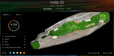
Hole 10, Round 1, Off the Tee
The description that the USGA gives hole number 10 is
The player faces a decision from the tee: hit a shot of about 220 yards to a plateau, leaving a relatively level lie, or drive it over the hill. Distance control is critical on the approach shot, whether from 180 yards or so to a green on a similar plateau, or with a shorter club at the bottom of the hill or, more dauntingly, part of the way down the hill. The approach is typically downwind, to a green with a closely mown area behind it.
First I’ll say, always hit driver off the tee. Look at the cluster! If you get it down the hill you’ll be in the fairway! In the vast, vast majority of the time, it’s better to be closer to the hole. Golf tips aside, when I first saw this graph, it popped out as a great example to use as a clustering example.
Shift command 4 if you want selective screenshots
When looking at this picture, the dots represent where the players hit their tee shots on hole 10 in the first round, and the colors show how many strokes it took them to finish the hole in relation to par. For this, we’re ignoring the final score and only looking at the shots themselves.
Hole 10, Round 1, Approaching the green
One data set isn’t good enough to demonstrate the differences of the algorithms, and I wanted to find an example of a green with collection areas that would make approach shots group together. Little did I know, the 10th green, the same hole as the one above showing the drives, is the best example out there. If you’re short, it rolls back to you. If you’re long, it rolls away. You gotta be sure to hit the green. You can see that here.

So this will be a second example of data for all the algorithms.
Algorithms themselves
This time, in this blog post, I’m only looking for results, not going through the algorithms themselves. There are other tutorials online talking about them, but for now at least, we’re only getting little introductions to the algorithms and thoughts.
Instead, I use the Scikit-Learn implementations of the algorithms. Scikit-Learn offers plenty of clustering algorithms, which I could spend hours using and writing about, but for this post, the ones I chose are K Means, DBSCAN, Mean Shift, Agglomerative Clustering.
Other Notes
Before going in to the algorithms, here are a few notes on what to expect.
-
Elevation is key as to why there are clusters. If you look around the other holes, you won’t see close to as much distribution and clusters of shot results. Now, if we had elevation as a data point as well, then we could really do some great cluster analyses.
-
The X and Y values on the sides of the graphs represent yards from the hole, which is located at the (0,0) location. If you look at the first post, I show that if you measure the hypotenuse using those X and Y numbers, you’ll have the yardage to the pin.
-
This isn’t a vast data set. We have 156 points in the two data sets because that’s how many players there were in the tournament.
-
If you’re wondering which part took the longest, it was writing the matplotlib code to automatically create figures with multiple plots for different input variables, and have them all show up at once. Presentation is key, and that took tons of time.
Code
I put all the code and data on Github here, so if you want to see what’s going on behind the scenes and what it took to do the analysis, look there.
Questions, comments, concerns, notes, thoughts, etc: contact, twitter, and golf twitter if you’re interested in that too. Ok, algorithm time.
K Means
I’m starting with K Means because this was the clustering algorithm I was first introduced to, and one that I had to write myself during a machine learning class in college.
Here’s an overview: Pick n_cluster random points on the graph. For each point, assign it to the nearest cluster center. After all are assigned, change the cluster centers to be the average of all the points in that cluster. Then repeat until the cluster centers don’t change, or that they don’t change by a certain amount or max number of repetitions.
The thing with K Means, which you’ll see with some of the other algorithms as well, is that we’re in charge of saying how many clusters we want the algorithm to find. This requires us to think a little about how many clusters we see ourselves. Looking closely at the picture above that I screenshotted from the U.S. Open site, I see either 2 or 4 clusters. If it’s 2, then there’s the tightly lined grouping parallel to the fairway lines, and then the group back and further away from the hole. If we try 4 clusters, I can see the further away group having 3 specific clusters, or rather, clusters within a cluster: missed fairway left, hit the fairway, or missed the fairway right. Let’s see how K Means handles these.
Let’s see how it does with the tee shot.
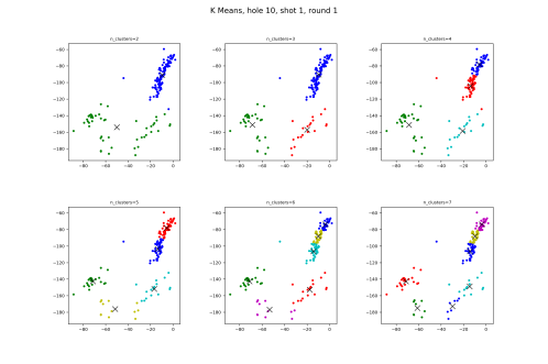
You can see how K Means matches the two cluster idea as well as, importantly, the three cluster grouping. But when we start asking for four clusters, K Means goes in the bad direction, splitting the fairway batch to two clusters. And the splitting of the long group continues the more clusters you ask for.
Moving to the approach shots,
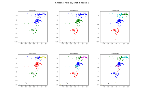
This time K Means nails what we’re looking for, with three clusters matching the in front, on, and behind the green collection areas. And with four clusters, it goes out and puts the two shots very short of the green in their own cluster.
What does this mean? K Means is pretty good, in that it groups, for the most part, graph points that we ourselves view as clusters.
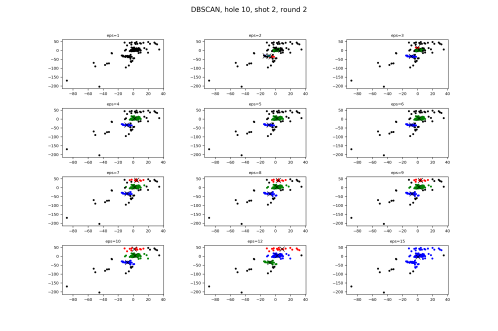
DBSCAN
DBSCAN, or “Density-based spatial clustering of applications with noise” is different from the others, where we don’t have to say how many clusters we want to use, but we do have a different type of parameter to tell the algorithm how we think the data should be grouped. This variable is called eps.
The two differences about DBSCAN are that first, I don’t have to tell it how many clusters I want it to find, and second, it finds outliers if they’re way out on their own. That being said, there is a parameter we have to submit ourselves, which is the maximum distance between points for it to be considered an outlier. It also has the best looking examples as shown on the scikit learn clustering page.

Look at eps=15. It says the fairway group, laying up, missing left, and missing right are all clusters on their own, and that the one tee shot in the fairway bunker long and left is an outlier. That’s perfect. Exactly what we had in our minds. Very impressive.
From an overall viewpoint, when we start with small eps values, there are tiny, dense tee shot clusters where most of the shots are outliers. As we grow eps bigger, we see a move where the smaller and nearby clusters are being grouped together, until they’re all in one at the end.
This means this algorithm works perfectly for the approach shots too, right? Right??
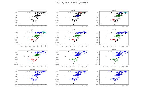
First thing to see is that our eps values in this group of graphs is much lower than the ones used in the fairway. Remember, this is because eps is saying how far away from the clusters a shot becomes an outlier.
The big point for me is when eps jumps from 7 to 8. With 7, we have the three groups that we see to begin with, and more than a few outliers. Then when we jump to 8, rather than the outliers being grouped, we see a merge of the back two clusters, something that isn’t correct.
To get a better understanding of the approach shot results, I went ahead and ran DBSCAN against the approach shots during the second round. Note that the graphs look different because of that one, giant outlier in the bottom left.
Same groups of epss, but you can see here that making that number larger is strictly for adding previous outliers into the three clusters. This looks very good, and what we ourselves would be thinking as being clusters.
With each of these clustering algorithms, we have to pass in a parameter to give the algorithm a head start in knowing how to act. With DBSCSN, passing a number explaining how close we think data points need to be if they’re considered in a cluster is much better than telling how many clusters we expect. DBSCAN ability to decide for us how many clusters, and which points are outliers, is what we’re looking for.
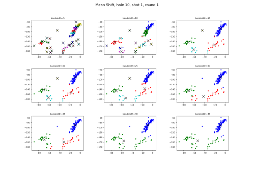
Mean Shift
Mean Shift is next, which is another great algorithm where we don’t have to tell it how many clusters we’re looking to find. Dynamic clustering is fantastic.
Pick a center point. Measure the density of points surrounding the center point. Move the center point to a different nearby location where we calculate there will be a higher density of points. Continue until we find a center point that contains the highest density of out data points. Then we repeat the process making sure to cover starting points all around the graph.
For imagination purposes, imagine starting 50 yards in front of the 10th green, and a circle with a radius of 10 yards. Realizing that if we move that point closer to the front edge, we’ll have more points within our circle. We keep doing that until we find that if we move closer to the green, in this case up the hill in front, we’ll have fewer balls in our circle. That’s the center.
In this we also don’t have to tell the algorithm how many clusters we want it to find, which, again, is great. We do have to give somewhat of a notation of how big we want the circle to be. This is called bandwidth, and Scikit learn has a function for estimating it, or we can tell it what we’re looking for.
Let’s look at the tee shots.
In the middle row, 20 and 25 show a mistake, where there are points in the red and dark blue clusters that should be belonging to the light blue and red clusters respectively. Moving on to the 30, we see that it groups the two bottom right clusters together, whereas the others group the two bottom left.
As for the approach shot,

Look at the bandwidth of 20. Do you see the group of four shots in between the blue and red clusters? Why are two in the red and two in the blue? As a spectator, I’d say those are close enough where they should all be in one cluster rather than separated. Incidentally though, K Means has that part as well.
Looking at the results here, for this specific data, I don’t see that Mean Shift does much other than K Means. As always, I’m guessing there’s a set of shots from the US Open that can distinguish Mean Shift from the other algorithms.
Agglomerative Clustering
Agglomerative Clustering is a neat little tree algorithm, classified in the hierarchical clustering category, in this case bottom up. Our input parameter is the number of clusters we want to have in the end.
We start with all points being their own cluster. We then look through and calculate the numbers for how close all of the clusters are to each other using some distance algorithm such as average distance. As long as we have more clusters than the num_clusters parameter, we combine the two clusters that are closest together into a single cluster. We then continue the process until we’re down to num_clusters.
Let’s see how it does.

It’s very mimicy of K Means, the other algorithm where we tell it how many clusters we want, other than what cluster the back middle grouping belongs to.
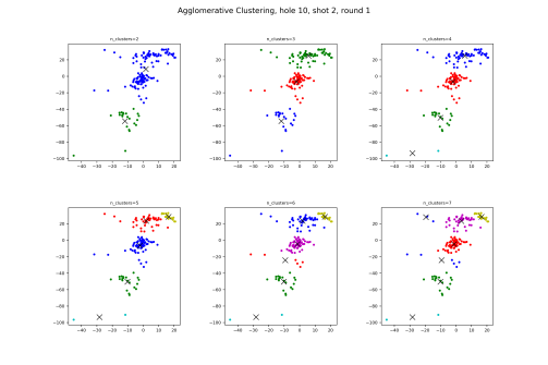
Same as said just above, where the approach shot clustering is also very similar to the others.
Which algorithm wins?
There’s never a winning algorithm of this type, because the results change with the different data sets, and because it depends on what the found clusters are used for, where in this case, there isn’t much of an outside use.
However, I will say that DBSCAN would be one that I’d want to use. The big things for me are that I don’t want to have to specify how many clusters I want it to find, and I want the algorithm to have the ability to tell me what’s an outlier.
Posts like this always leave open ended conclusions, as is the case here. I talked about the results from only two data sets and tried to say which algorithm was the best of all.
Another disappointment is that we’re only in two dimensions. If we not only had location, but also elevation, then I’m very curious how well these algorithms would do in clustering.
This data is also absolutely perfect if you’re looking for data to write the clustering algorithms yourself, rather than rely on the Scikit-Learn algorithms and claim that you know all about the nuances. So please, someone should go and do that.
My only complaint with the data is that they’re missing some valuable information, such as what cut of grass the ball is in (fairway, rough, fescue), the landing spot, current wind direction, elevation, etc. If given more, then we could really do some cluster analysis.
If you have more analysis you’re looking for, let me know and I can write something up later. We have a great deal of information about all the shots hit the entire tournament. Angles into the green, tee shot dispersion, benefits of being closer to the green, and I’m sure I can come up with more.
Like this:
Like Loading…
Related