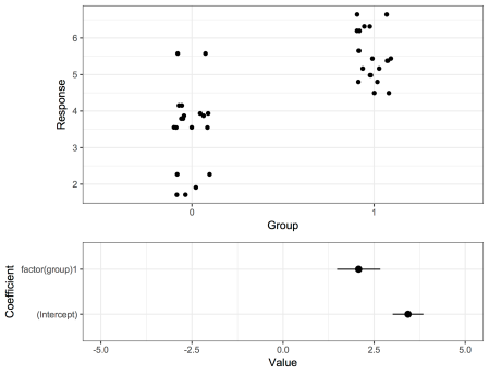
Visualising a difference in mean between two groups isn’t as straightforward as it should. After all, it’s probably the most common quantitative analysis in science. There are two obvious options: we can either plot the data from the two groups separately, or we can show the estimate of the difference with an interval around it.
A swarm of dots is good because it shows the data, but it obscures the difference, and has no easy way to show the uncertainty in the difference. And, unfortunately, the uncertainty of the means within groups is not the same thing as the uncertainty of the difference between means.
An interval around the difference is good because it makes the plausible range of the difference very clear, but it obscures the range and distribution of the data.
Let’s simulate some fake data and look at these plots:
We start by making two clouds of dots. Then we estimate the difference with a simple linear model, and plot the difference surrounded by an approximate confidence interval. We can plot them separately or the egg package to put them together in two neat panels:
Here it is:

But I had another idea. I am not sure whether it’s a good idea or not, but here it is: We put in the dots, and then we put in two lines that represent the smallest and the greatest difference from the approximate confidence interval:


I think it looks pretty good, but it’s not self-explanatory, and I’m not sure whether it is misleading in any way.
Related