Opher Donchin writes in with a question:
We’ve been finding it useful in the lab recently to look at the histogram of samples from the parameter combined across all subjects. We think, but we’re not sure, that this reflects the distribution of that parameter when marginalized across subjects and can be a useful visualization. It can be easier to interpret than the hyperparameters from which subjects are sampled and it is available in situations where the hyperparameters are not explicitly represented in the model. I haven’t seen this being used much, and so I’m not confident that it is a reasonable thing to consider. I’m also not sure of my interpretation.
My reply:
Yes, I think this can make a lot of sense! We discuss an example of this technique on pages 155-157 of BDA3; see the following figures.
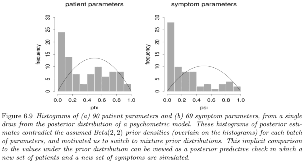
First we display a histogram of a draw from the posterior distribution of two sets of parameters in our model. Each histogram is a melange of parameters from 30 participants in the study.

The histograms do not look right; there is a conflict between these inferences and the prior distributions.
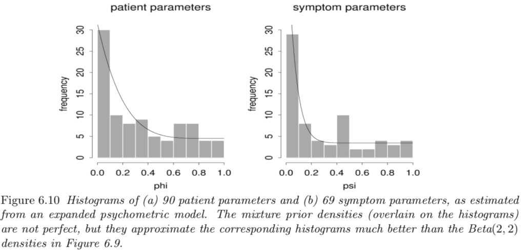
So we altered the model. Here are the corresponding histograms of the parameters under the new model:

These histograms seem like a good fit to the assumed prior (population) distributions in the new model.
The example comes from this 1998 article with Michel Meulders, Iven Van Mechelen, and Paul De Boeck.