In this previous post, I showed how one can scrape top-level NBA game data from BasketballReference.com. In the post after that, I demonstrated how to scrape play-by-play data for one game. After writing those posts, I thought to myself: why not do both? And that is what I did: scrape all the box scores for the 2017-18 NBA season and save them to an RDS object.
The code for web scraping can be found here. I don’t think it’s particularly insightful to go through the details line-by-line… What I’ll do instead is explain what is in the saved RDS object which will allow you to make use of the data, and I’ll end off with some visualizations to demonstrate what one can do with this data, specifically:
-
Do Kevin Durant and Steph Curry get in each other’s way?
-
Are the Golden State Warriors really better in the 3rd quarter?
(Code that I wrote for these questions can be found here.) Let’s load the packages and data (data available as links from this page):
First, let’s take a quick look at game_df which contains the top-level game data:
The first column, game_id, is BasketBallReference.com’s way of uniquely identifying a game. For example, if we wanted to see the results of the game between the Celtics and the Cavs on 17 Oct 2017, we would look up the game_id (201710170CLE) and go to the URL https://www.basketball-reference.com/boxscores/201710170CLE.html. The game_id is how I was able to scrape the box scores for all the games.
Next, let’s look at the master_list object which contains all the box score information:
It is a list of length 1312, which corresponds to the total number of games (Regular Season and Playoffs) in the 2017-18 season. The keys of the list are the game_ids, and (as we will see shortly) each element of the list is itself a list of length 5. Let’s take a closer look at the first element of the list:
The first 4 elements of the list (visitor_basic_boxscore, visitor_adv_boxscore, home_basic_boxscore, home_basic_boxscore) are data frames for the basic and advanced box scores of both teams. They are the box scores you see on BasketBallReference.com (with some minor preprocessing):


Box scores from BasketballReference.com.
The last element of the list is a data frame containing play-by-play information, much like that in the previous post.
Hopefully some of you will take this data and make some cool data visualizations from it! Below, I will walk through how I use this dataset for two visualizations.
Do Kevin Durant and Steph Curry get in each other’s way?
Kevin Durant and Steph Curry are two of the most lethal scorers in today’s game. Does both of them being on the same team hamper the other’s production? This is pretty difficult to pin down what we mean by this statement precisely; we will instead make do with a couple of suggestive plots.
The first plot we can make is a scatterplot of the points scored by these two players. If the relationship is positively correlated, it could mean that they make each other better.
Let’s pull out the game_ids for Golden State:
Next, we set up a data frame consisting of 4 columns: the game_id, game_type (regular or playoff), and points scored by players 1 and 2 respectively.
The loop below builds up the data frame row by row (not the most R-like way of programming but it gets the job done…):
Next, we make the scatterplot (notice how we can use the get function to refer to the columns programmatically). We force the axes to start at 0 and the aspect ratio to be 1, and include the 45 degree line for reference.

One might say, wouldn’t it be better to compare games where KD and Curry play, vs. games where only KD plays? If KD scores more if he is playing with Curry, that could suggest that playing together makes him more productive. To make these plots, we introduce two new columns which are Boolean variables representing whether a given player played in that game or not. We then make boxplots to compare the points scored depending on whether the other player played.


From the plots, it looks like each player scores a bit more when the other person is not playing, although there is quite a bit of variance.
Instead of looking at points scored, we could look at more sophisticated measures of production. For example, the NBA computes individual offensive and defensive ratings for each game based on a complicated formula (see here for details). These measures are provided as ORtg and DRtg in the advanced box score.
The code below pulls out the ORtg and DRtg values for KD and Curry:
And here are the plots (along with a linear fit):
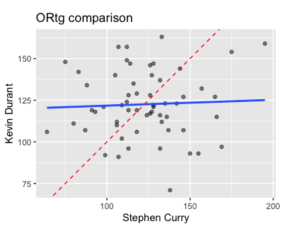

This was pretty interesting to me: it looks like the ORtgs are independent of each other while the DRtgs are highly correlated with each other. Might this suggest that defense is more of a team activity, while offense can be driven by individuals?
There are of course many other visualizations we could do to explore this question. We might also want to see how the KD-Curry pairing compares with other pairings. Because of the way the code is written, it’s really easy to generate these figures for other pairings: we just need to update the team_name, player1 and player2 variables and rerun the code. As an example, here are the ORtg and DRtg scatterplots for Damian Lillard and C.J. McCollum of the Portland Trail Blazers:
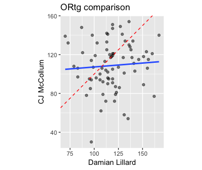

We see similar trends here.
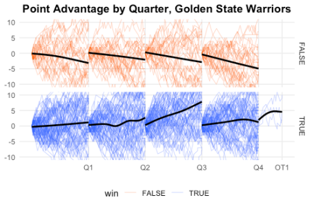
Are the Golden State Warriors really better in the 3rd quarter?
Last season, it seemed like the Warriors were often down at the half, only to come roaring back in the third quarter. Is this really their best quarter? (This NYT article says yes and suggests why that might be the case.) To answer this question, we’ll make a lead tracker graphic (much like the previous post) but (i) we will do it for all games GSW played in, and (ii) we reset the score differential to 0 at the beginning of each period.
We first set up a data frame that records the game_id, whether the team was at home, and whether they won (we might want to use latter two variables in our plotting later):
Next, we create a list with keys being the game_ids and the value being the play-by-play data frame from the master list we scraped earlier. We standardize the column names so that GSW’s score is labeled team and the opponent’s score is labeled opp. (Note: At the time of writing, BasketBallReference.com had incorrect data for the game 201710200NOP, so I have removed that game from our data.)
We create a function parse_pbp which helps us reset the score at the beginning of every quarter. To make the lines in our eventual visualization smoother, parse_pbp also adds additional rows for the beginning and end of every quarter.
Finally, we make the list into a dataframe:
We can now make the line plot easily. We use the interaction function to group the line plots by both game_id and quarter, color the lines by whether GSW won or not, and manually define the breaks to be at the end of the periods:

It may not be so obvious in this plot, but there certainly seems to be a bit of a difference in the third quarter. On average, the Warriors are even or up 1-2 points, but in the third quarter GSW gains almost 5 points. The difference is more obvious in the plot below, where we zoom in on the y-axis. (Note that we have to use coord_cartesian instead of scale_y_continuous to zoom in: scale_y_continuous will remove the points outside the range before plotting, which results in the incorrect result for the geom_smooth layer.

The advantage becomes even more obvious when we facet by whether GSW won or not: in wins, they gain almost 10 points in the 3rd quarter, compared to something like 1-3 points in each of the other quarters.
Related