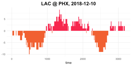
For each NBA game, nba.com has a really nice graphic which tracks the point differential between the two teams throughout the game. Here is the lead tracker graphic for the game between the LA Clippers and the Phoenix Suns on 10 Dec 2018:
![]()
![]()
Taken from https://www.nba.com/games/20181210/LACPHX#/matchup
I thought it would be cool to try recreating this graphic with R. You might ask: why try to replicate something that exists already? If we are able to pull out the data underlying this graphic, we could do much more than just replicate what is already out there; we have the power to make other visualizations which could be more informative or powerful. (For example, how does this chart look like for all games that the Golden State Warriors played in? Or, how does the chart look like for each quarter of the game?)
The full R code for this post can be found here. For a self-contained script that accepts a game ID parameter and produces the lead tracker graphic, click here.
First, we load the packages that we will use:
We can get play-by-play data from Basketball-Reference.com (here is the link for the LAC @ PHX game on 2018-12-10). Here is a snippet of the play-by-play table on that webpage, we would like to extract the columns in red:


Play-by-play data from basketball-reference.com.
The code below extracts the webpage, then pulls out rows from the play-by-play table:
events is a character vector that looks like this:
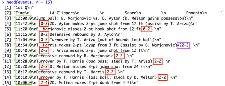 We would really like to pull out the data in the boxes above. Timings are easy enough to pull out with regular expressions (e.g. start of the string: at least 1 digit, then :, then at least one digit, then ., then at least one digit). Pulling out the score is a bit trickier: we can’t just use the regular expression denoting a dash – with a number on each side. An example of why that doesn’t work is in the purple box above. Whenever a team scores, basketball-reference.com puts a “+2” or “+3” on the left or right of the score, depending on which team scored. In
 events, these 3 columns get smushed together into one string. If the team on the left scores, pulling out number-dash-number will give the wrong value (e.g. the purple box above would give 22-2 instead of 2-2).


To avoid this issue, we extract the “+”s that may appear on either side of the score. In fact, this has an added advantage: we only need to extract a score if it is different from the previous timestamp. As such, we only have to keep the scores which have a “+” on either side of it. We then post-process the scores.

Next, we split the score into visitor and home score and compute the point differential (positive means the visitor team is winning):

Next we need to process the timings. Each of the 4 quarters lasts for 12 minutes, while each overtime period (if any) lasts for 5 minutes. The time column shows the amount of time remaining in the current period. We will amend the times so that they show the time elapsed (in seconds) from the start of the game. This notion of time makes it easier for plotting, and works for any number of overtime periods as well.

At this point, we have enough to make crude approximations of the lead tracker graphic:


Getting the fill colors that NBA.com’s lead tracker has requires a bit more work. We need to split the visitor_adv into two columns: the visitor’s lead (0 if they are behind) and the home’s lead (0 if they are behind). We can then draw the chart above and below the x-axis as two geom_ribbons. (It’s a little more complicated than that, see this StackOverflow question and this gist for details.) Colors were obtained using imagecolorpicker.com.

Almost there! The code below does some touch up to the figure, giving it the correct limits for the y-axis as well as vertical lines for the end of the periods.

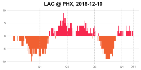
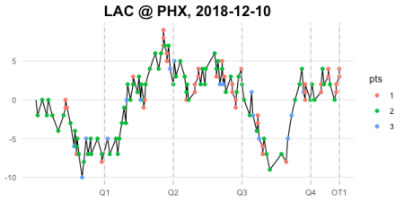
The figure above is what we set out to plot. However, since we have the underlying data, we can now make plots of the same data that may reveal other trends (code at the end of this R file). Here are the line and ribbon plots where we look at the absolute score rather than the point differential:


Here, we add points to the line plot to indicate whether a free throw, 2 pointer or 3 pointer was scored:

The possibilities are endless!
Related