I’ve lived in New York for over fifteen years, and I’ve never seen the City as paralyzed by snow as it was on Thursday. I’ve heard story after story of stranded friends and colleagues. Major thoroughfares became clogged with stuck cars. It was almost like - dare I say it - Washington DC when it snows.
So what happened?
NYC Mayor De Blasio at first told NY1:
“When it finally became clear we were going to get fast and intense snow, rush hour was already beginning. Everything was having a multiplier effect in a bad way.”
He later seemed to admit he had gotten the revised forecast that morning well before rush hour:
“I think the crux of this matter was on Wednesday night the National Weather Service was saying 1 to 2 inches. Around Thursday morning, it jumped up to 3 to 5 inches,”
Interestingly, WPIX actually reported as early as Wednesday morning – the day before the storm – that one of the two main models used for prediction was predicting 5 inches for New York City, which is close to what we got:
Total accumulations for the city vary between the various forecast models.The “global” model is indicating mainly a rain event for the city with little to no snow accumulation, whereas the “North American” model is forecasting close to 5 inches for the city.
So we should not have been completely blindsided, though it sounds like the National Weather service did not give the right warnings until the morning of. Let’s give the city the benefit of the doubt here and say we had no idea what was happening until Thursday morning, a few hours before the snow started coming down. One question is as soon as we got the revised totals, we must have pushed to bring more plows out when things started to look bad, right?
To find out, I downloaded raw data snapshots from PlowNYC (which had only been viewed 41 times before apparently), and decided to see if I could get a read on the city’s snow plow activity.
The data is stored in an odd format - every 15 minutes it tells you the last time every street was serviced. We can’t see the number of trucks out which I was curious about, as that is the main knob the city likely has to turn. But we can see the rate that streets are plowed, which is going to be very correlated with that.
To investigate this storm, I took snapshots from 3PM (about 1.5 hours after the snow began to come down), 5PM and 7PM. If the city decided to change strategy that morning, and push to get more and more plows out ASAP, we should see the number of streets recently plowed start to go up as we get later in the day and more trucks become mobilized. By 5PM, it was pure chaos out there, so we must have pushed hard for a change, right?
To measure this, I made a chart of the number of street segments plowed in the last N minutes, where N is the x-axis of the chart. As N increases, more and more street segments are included as you are looking farther back in time.
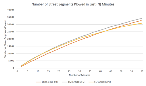
The data shows that about 20,000 street segments were being touched in the previous 30 minute period at 3PM (in orange). What is odd is that you can see what looks like a very similar rate at 5PM in grey and then again at 7PM in yellow. That means that even while the commute was turning into complete hell, the number of plows on the street do not seem to have increased in any meaningful way. Puzzling given what was happening around the city. I realize you can’t mobilize plows immediately, but I was still surprised to see this given the updated weather received in the morning, and how bad things were going.
Another question is what percent of our plows did we have out for the storm? Is 20,000 street segments in 30 minutes close to maximizing our plow capacity? To find out, I compared this snow storm to a storm last season, marked in Blue. That storm, on March 21st, dropped 8 inches or so, but was expected to drop much more. So we probably fully mobilized for that one.
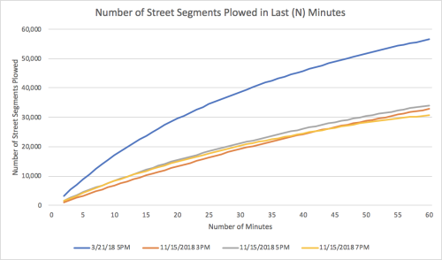
The chart shows this historical storm at rush hour in blue. You can see the rate of plowing is almost double, (about 40,000 street segments per 30 minutes of plowing). This helps us quantify the different in equipment deployed between a storm we take seriously and one we don’t.
So in the end, the data shows us two things- first we seemed to have rolled out last week at about half our capacity and that cost us. Second, we did not ramp up our deployment even as things got worse and fell apart.
I was also curious what the state of the world looked like at 5PM, so I made a map which shows how long it had been since each road had been plowed when rush hour came. Street segments in black had not yet been serviced at all. The others you can roll your mouse over to get a sense of how many minutes it has been as of rush hour, green being the last number of minutes and red being the most:
Open Data creates a new layer of transparency in government, and here we’ve used that transparency to compare what seemed to have happened against what we are told. Of course you can’t just make plows appear quickly, and I get that. But it’s interesting that even in one of the most dier snow situations I’ve ever seen in NYC streets, we as a city, were unable to reacllocate resources in any thing close to real time. It’s probably something our ellected officials should thing about for the future.
Raw Data Used: