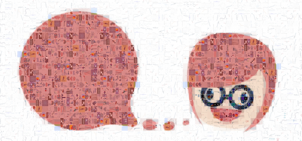
Look closely at the images above. Do you notice anything? If you zoom in close enough, you will notice that the pictures are composed entirely of small graphs and images. These images are part of the final results for my Data + Art STEAM project with Forest Hill Junior and Senior Public School.
I have to admit that it took me much longer than I had hoped to get this project all packaged up and finalized. A lot of that had to do with being busy, and a lot had to do with the desire to keep analyzing the data set and then being overwhelmed by the amount of analysis that the kids and I ended up producing!
As a reminder, STEAM stands for science, technology, education, art and math. I worked on this project with my good friend Katherine Lafranier and her gifted grade 6 students at Forest Hill Junior and Senior Public School. She had just taken her class through a unit on data management and we used this project to teach them how to collect data through surveys and analyze it with Google Sheets. For our research project the students picked the subject: “Self-analysis: Exploring student lifestyles and how it relates to their self-perception”.The final survey format is available here.
We created the survey together and then the students set off to survey their school peers. We consolidated their collected data and they each analyzed it with the skills they were taught in class. They were then to review their analysis and submit a range of images to show their findings. The images should include both graphs and pictures which were inspired by their findings. That takes care of the science, technology and math portion of STEAM. For the art portion, all images were bundled up into a large mosaic to produce a higher level graphic relating to students feelings and self perception. I’m really excited that the students produced a large enough volume of analysis to produce such cool mosaics above!
Below I’m going to take you through some of the highlights of the analysis. Please keep in mind that this review only covers a fraction of the analysis performed and that there are some known data quality issues associated with manual survey collection.
The first and easiest thing to look at was the relationship between numerical variables. I had a look to see if there was any relationship between a students time spent on their screens, sleeping, being physically active and doing homework.

Correlation
I began by producing a quick correlation matrix. The thing that immediately jumped out at me was the inverse relationship between sleep time and screen time. This chart implies that the more time a student spends on the screen, the less time they sleep and vice versa.
Of course I wanted to jump at this finding, but it’s important to ensure that there is nothing else going on here. I needed to look at the other factors involved in this type of association. I visualized a variety of other relationships through scatterplots.

Scatterplots
If you look at the top left image above, we see the continued trend that as screen time goes up, sleep time goes down. However, we begin to see some of the cracks in the data set. There are a few folks who have listed 2-4 hours sleep and I start to think there are some erroneous data points. I then have a look at sleep time and screen time by grade to see if grade is a confounding factor. If you look at the graphs above you will see that screen time goes up by grade and sleep time goes down by grade. Therefore without the grade level being isolated, it can appear that as sleep time goes down when screen time goes up. I tried to get a visual of the relationship between these variables with grade holding steady by plotting screen time vs screen time by grade. Though it still looks like there is an inverse relationship, the data is really too small to make conclusions from.

Animation
Just for fun, I decided to make a little animation which shows how the spread of sleep time changes from grade to grade.
The animation uses a boxplot graph. Box plots use a box to represent the 25-50th percentiles of the data. The middle bolded line shows the median value. The lines (often called whiskers) show the lower 0-25th and upper 75th-100th percentiles. The little dots are outliers.
In this graph you can see that the distribution of screen time typically gets higher as the grades get higher.


Gender
Since our data set collected both gender and self description, I wanted to see see if the students saw themselves differently by gender. Our students interviewed 92 females, 91 males and two students who don’t identify.
Self Perception
To get started, I created a fun little word cloud of the words the students used to describe themselves broken down by gender. The female responses are in pink and male in blue. At first blush it looks like most students use positive terms to describe themselves!

Favorite subjects
I then wanted to see if there was any difference between males and females in the sentiment (positive/negative) used for self description. I used the affin lexicon included in the tidytext package to give a sentiment ranking to the words used for self description. The afinn scale ranges from -3 to +3. A very negative word like agonizing would have a ranking of -3 and a very positive word like affectionate would have a ranking of +3. I was very pleasantly surprised that out of the 54 unique descriptive words used across male and female, the spread of sentiment used for self description was almost identical! The median score was +2 for both males and females. This is excellent because it means that not only are students describing themselves in a positive tone, the gender sentiment tones are also roughly equal!

Now, I didn’t focus too much of my own efforts on the horoscope connection. But, boy did the students do a great job!
As can be seen in this quad chart, the students analyzed a variety of distributions by horoscope sign. They then looked into how their star sign affects a variety of factors. They analyzed everything from time spent as shown in the graphs below to personality traits like introvert/extrovert and optimist/pessimist. I was very impressed by the variety of angles they explored!
I also loved how a few students were inspired to make an image showing their take aways from the analysis. This quote “I’m one of seven female virgos who took the survey” shows that she considered how she personally fit into the broader survey population!

Another aspect that I loved about this survey was seeing what all of the kids wanted to be when they grew up. I looked at this data from a variety of lenses. One of the most interesting views to me was viewing the career breakdown by gender. Doctor, lawyer, scientist and engineer are common popular choices among the genders. Athletic careers tended to be more prevalent in the boy choices. Both genders had a healthy dose of students still unsure of their career path and that is okay! I loved that a student even submitted an image with the finding that it’s totally normal not to know your dream job yet!

I didn’t dive too deep into how the students spent their play time. But, because I love a nice little image word cloud created in R, I had to make this one.
Of course tv is a popular way to spend time, but I noticed that these are some well rounded kids! We can see baking, piano, tennis, lego, origami and guitar as hobbies listed among others.

This is another area that the students really dove into. Like the star sign analysis, the students analyzed how your introvert/extrovert tendencies can impact a variety of factors or how your personality factors could impact these tendencies.
The students also put a number of killer images with hilarious cartoons about what it’s like to be an introvert. Of course I LOVED these. It’s extra touches like this that can make finding insights more fun.
THANK YOU
This is just the tip of the iceberg when it comes to the work that the students and myself did to analyze the data set. Please feel free to have a look on my github repo for the full set of images and code.
Thanks for reading along and please share your thoughts and creations with me on twitter.
Note that the full code is available on my github repo. If you have trouble downloading the file from github, go to the main page of the repo and select “Clone or Download” and then “Download Zip”.
Related