[image of cat lifting weights]
A graduate student who wishes to remain anonymous writes:
I was wondering if you could answer an elementary question which came to mind after reading your article with Carlin on retrospective power analysis. Consider the field of exercise science, and in particular studies on people who lift weights. (I sometimes read these to inform my own exercise program.) Because muscle gain, fat loss, and (to a lesser extent) strength gain happen very slowly, and these studies usually last a few weeks to a few months at most, the effect sizes are all quite small. This is especially the case when comparing any two interventions that are not wholly idiotic for a difference in means. For example, a recent meta-analysis compared non-periodized to periodized strength training programs and found an effect size of approximately 0.25 standard deviations in favor of periodized programs. I’ll use this as an example, but essentially all other non-tautological, practically relevant effects are around this size or less. (Check out the publication bias graph (Figure 3, page 2091), and try not to have a heart attack when you see someone reported an effect size of 5 standard deviations. More accurately, after some mixed effects model got applied, but still…) In research on such programs, it is not uncommon to have around N=10 in both the control and experimental group. Sometimes you get N=20, maybe even as high as N=30 in a few studies. But that’s about the largest I’ve seen. Using an online power calculator, I find you would need well over N=100 in each group to get acceptable power (say 0.8). This is problematic for the reasons outlined in your article. It seems practically impossible to recruit this many subjects for something like a multi-month weight training study. Should I then conclude that doing statistically rigorous exercise science—on the kinds of non-tautological effects that people actually care about—is impossible? (And then on top of this, there are concerns about noisy measurements, ecological validity, and so on. It seems that the rot that infects other high noise, small sample disciplines, also infects exercise science, to an even greater degree.)
My reply:
You describe your question as “elementary” but it’s not so elementary at all! Like many seemingly simple statistics questions, it gets right to the heart of things, and we’re still working on in our research.
To start, I think the way to go is to have detailed within-person trajectories. Crude between-person designs just won’t cut it, for the reasons stated above. (I expect that any average effect sizes will be much less than 0.25 sd’s when “when comparing any two interventions that are not wholly idiotic.”)
How to do it right? At the design stage, it would be best to try multiple treatments per person. And you’ll want multiple, precise measurements. This last point sounds kinda obvious, but we don’t always see it because researchers have been able to achieve apparent success through statistical significance with any data at all.
The next question is how to analyze the data. You’ll want to fit a multilevel model with a different trajectory for each person: most simply, a varying-intercept, varying-slope model.
What would help is to have an example that’s from a real problem and also simple enough to get across the basic point without distraction.
I don’t have that example right here so let’s try something with fake data.
Fake-data simulations and analysis of between and within person designs
The underlying model will be a default gradual improvement, with the treatment being more effective than the control. We’ll simulate fake data, then run the regression to estimate the treatment effect.
Here’s some R code:
And here are the simulated data from these 50 people with 10 measurements each.
I’m simulating two experiments. The top row shows simulated control and treatment data from a between-person design, in which 25 people get control and 25 get treatment, for the whole time period. The bottom row shows simulated data from a within-person design, in which 25 people get control for the first half of the experiment and treatment for the second half; and the other 25 people get treatment, then control. In all these graphs, the dots show simulated data and the lines are blue or red depending on whether control or treatment was happening:
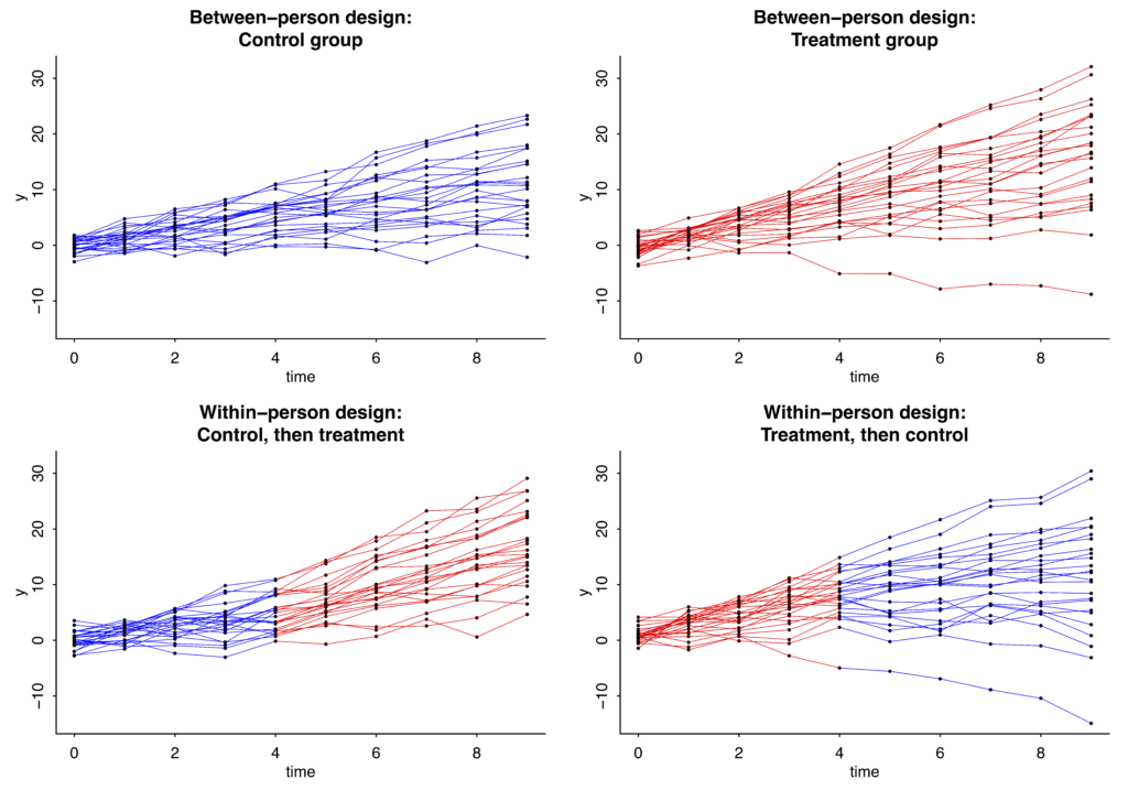
In this case the slopes under the control condition have mean 1 and standard deviation 1 in the population, and the treatment effect is assumed to be a constant, adding 1 to the slope for everyone while it is happening.
Here’s the result from the regression with the simulated between-person data:
The true value is 1 but the point estimate is 0.5. That’s just randomness; simulate new data and you might get an estimate of 1.1, or 0.8, or 1.4, or whatever. The relevant bit is that the standard error is 0.3.
Now the within-person design:
With this crossover design, the standard error is now just 0.1.
A more realistic treatment effect
The above doesn’t seem so bad: sure, 50 is a large sample size, but we’re able to reliably estimate that treatment effect.
But, as discussed way above, a treatment effect of 1 seems way too high, given that the new treatment is being compared to some existing best practices.
Let’s do it again but with a true effect of 0.1 (thus, changing “theta = 1” in the above code to “theta = 0.1”). Now here’s what we get.
For the between-person data:
For the within-person data:
The key here: The se’s for the coefficient of “exposure”—that is, the se’s for the treatment effect—have not changed; they’re still 0.3 for the between-person design and 0.1 for the within-person design.
What to do, then?
So, what to do, if the true effect size really is only 0.1? I think you have to study more granular output. Not just overall muscle gain, for example, but some measures of muscle gain that are particularly tied to your treatment.
To put it another way: if you think this new treatment might “work,” then think carefully about how it might work, and get in there and measure that process.
Lessons learned from our fake-data simulation
Except in the simplest settings, setting up a fake-data simulation requires you to decide on a bunch of parameters. Graphing the fake data is in practice a necessity in order to understand the model you’re simulating and to see where to improve it. For example, if you’re not happy with the above graphs—they don’t look like what your data really could look like—then, fine, change the parameters.
In very simple settings you can simply suppose that the effect size is 0.1 standard deviations and go from there. But once you get to nonlinearity, interactions, repeated measurements, multilevel structures, varying treatment effects, etc., you’ll have to throw away that power calculator and dive right in with the simulations.