Gabriel Power writes:
Here’s something a little different: clever classrooms, according to which physical characteristics of classrooms cause greater learning. And the effects are large! Moving from the worst to the best design implies a gain of 67% of one year’s worth of learning! Aside from the dubiously large effect size, it looks like the study is observational yet cause-and-effect are assumed, and there are many degrees of freedom. I would say this is just the usual dog bites man stats mistakes, but governments might spend many millions on this…
OK, I took a look. They report a three-year study of 153 classrooms in 27 schools. They do multilevel modeling—hey, I like it already. And scatterplots! The scatterplots are kinda weird, though:
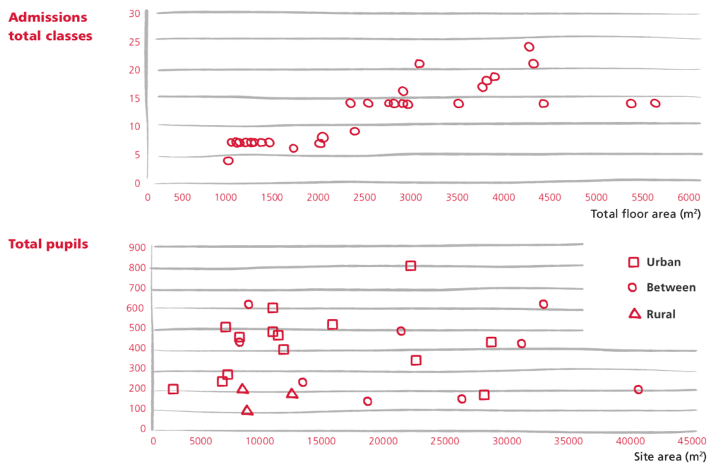
It’s a full color (or, I guess I should say, full colour) report, so why not use those colours in the graphs, instead of the confusing symbols. Also it’s not clear what happened to the urban and rural schools in the top graph, or why there are so many divisions on the x and y-axes or why they have all those distracting gray lines.
Throughout the report there are graphs, but it doesn’t seem that much statistical thought went into them. The graphs look like they were made by an artist, not in consultation with a data analyst. For example:
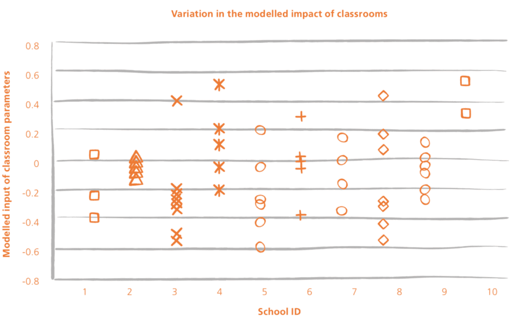
Plotting by school ID makes no sense, the symbols contain zero information, the graph is overwhelmed by all these horizontal gray lines, and, most importantly, I have no idea what’s being plotted! The title says they’re plotting the “impacts of classrooms” and the vertical axis says they’re plotting “input.” Inputs and impacts, those are much different!
I’m not trying to be a graphics scold here. Do whatever graphs you want! My point is that graphics—and statistical analysis more generally—are an opportunity, a chance to learn. Making a graph that’s pretty but conveys no useful information—that’s a waste of an opportunity.
I think there’s a big problem, which is that graphs are considered as a sort of ornament to the “real analysis” which is the regression. But that’s not right. The graphs are part of the real analysis.
In particular, nowhere are there graphs of the raw data, or of classroom-level averages. Too bad; that would help a lot.
Also, I can’t figure out what they did in their analysis. They have lots of graphs like this which make no sense:
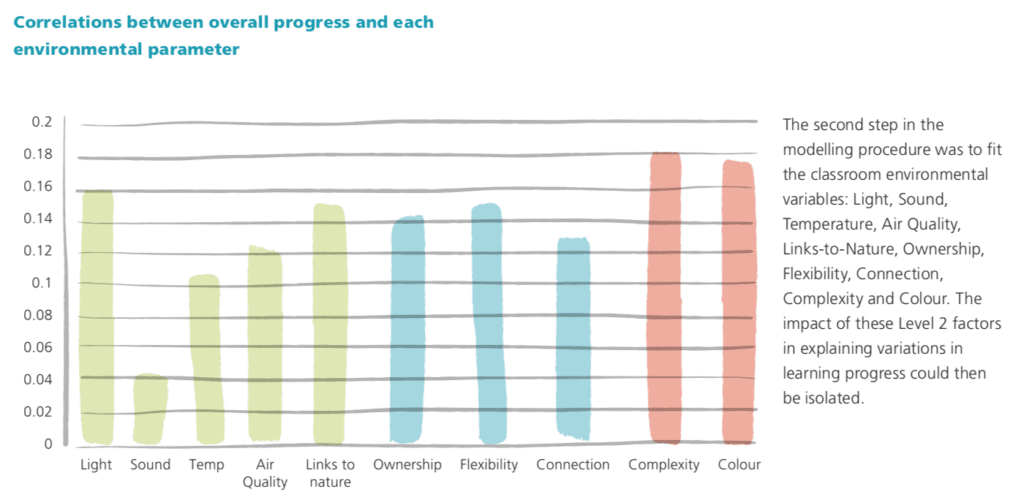
“Colour” is not a number so how can it have a numerical correlation with overall progress. And what exactly is “overall progress”? And why are correlations drawn as bars: they can be negative, no? Indeed, it’s suspicious that all of the correlations are between 0 and 0.18 and not one of them is negative.
The big picture
Stepping back, here’s what we see. These researchers care about schools and they know a lot about schools. I’m inclined to trust their general judgment about what’s good for schools, whether or not they do a quantitative study. They have done a quantitative study and they’ve used it to inform their judgment. They don’t know a lot of statistics, but that’s fine: statistics is not their job, they’re doing their best here.
The problem is what these researchers are thinking that statistics, and quantitative methods, can do for them in this setting. Realistically, doing things like improving the lighting in classrooms will have small effects. That doesn’t mean you shouldn’t do it, it just means that it’s unrealistic to expect large consistent effects, and it’s a mistake to estimate effects from observational correlations. (And effect size, not just direction of effect, can make a difference when it comes to setting priorities and allocating scarce resources.)