In the previous blog post, I showed you usage of my TSrepr package. There was shown what kind of time series representations are implemented and what are they good for.
In this tutorial, I will show you one use case how to use time series representations effectively. This use case is clustering of time series and it will be clustering of consumers of electricity load.
By clustering of consumers of electricity load, we can extract typical load profiles, improve the accuracy of consequent electricity consumption forecasting, detect anomalies or monitor a whole smart grid (grid of consumers) (Laurinec et al. (2016), Laurinec and Lucká (2016)). I will show you the first use case, the extraction of typical electricity load profiles by K-medoids clustering method.
Firstly, let’s load the required packages, data (elec_load) and return the dimensions of the dataset.
1 | |
There are 50 time series (consumers) of length 672, specifically time series of length 2 weeks of electricity consumption. These measurements are from smart meters from an unknown country.
It is obvious that dimensionality is too high and the curse of dimensionality can happen. For this reason, we have to reduce dimensionality in some way. One of the best approaches is to use time series representations in order to reduce dimensionality, reduce noise and emphasize the main characteristics of time series.
For double seasonal time series of electricity consumption (daily and weekly seasonality), the model-based representation approaches seem to have best ability to extract typical profiles of consumption. However, I will use some other representation methods implemented in TSrepr too.
Let’s use one of the basic model-based representation methods - mean seasonal profile. It is implemented in the repr_seas_profile function and we will use it alongside repr_matrix function that computes representations for every row of a matrix of time series. One more very important notice here, normalisation of time series is a necessary procedure before every clustering or classification of time series. It is due to a fact that we want to extract typical curves of consumption and don’t cluster based on an amount of consumption.
By using the TSrepr package, we can do it all in one function - repr_matrix. We will use z-score normalisation implemented in norm_z function.
We have 48 measurements during a day, so set freq = 48.
1 | |
We can see that dimensionality was in fact reduced significantly. Now, let’s use the K-medoids (pam function from cluster package) clustering method to extract typical consumption profiles.
Since we don’t know a proper number of clusters to create, i.e. a priori information about a number of clusters, an internal validation index is have to be used to determine an optimal number of clusters.
I will use well known Davies-Bouldin index for this evaluation. By Davies-Bouldin index computation, we want to find a minimum of its values.
I will set the range of number of clusters to 2-7.
1 | |
Let’s plot results of internal evaluation.
1 |
|
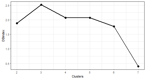
The “best” number of clusters is 7 (lowest value of the index).
Let’s plot the results of clustering with 7 number of clusters. I will use computed medoids stored in the object clustering. For a visualization, the facet_wrap function is very handy here.
1 | |
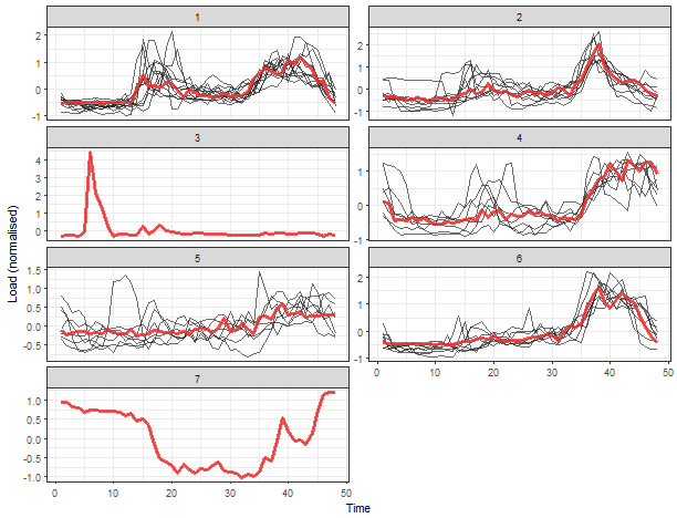
We can see 5 typical extracted profiles - red lines (medoids of clusters). The next two clusters are one-elemental, so they can be referred as outliers.
Now, let’s try some more sophisticated method for the extraction of seasonal profiles - GAM regression coefficients. By repr_gam function, we can extract double seasonal regression coefficients - daily and weekly (you can read more about the analysis of seasonal time series with GAM here).
However, the number of weekly seasonal regression coefficients will be only 6, because the number of the second seasonality coefficients is set to freq_2 / freq_1, so 48*7 / 48 = 7, and 7 - 1 = 6 because of splines computation (differentiation). I will again use repr_matrix function.
1 | |
So the dimension is 47 + 6 = 53 because of usage of splines in GAM method. Let’s cluster the data and visualize results of it.
1 | |
Let’s plot results of internal evaluation.
1 |
|
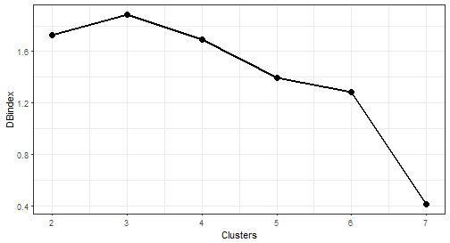
The optimal number of clusters is again 7. Let’s plot results.
1 | |
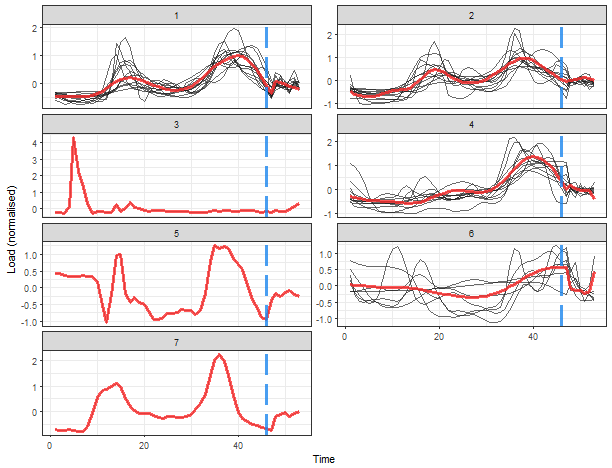
That is a more delightful result, isn’t it? Extracted consumption profiles are smoother than in the case of average seasonal profiles. The blue dashed line borders daily and weekly seasonal coefficients. The K-medoids now extracted 4 typical profiles and determined 3 one-element clusters.
I will show you also result of clustering of some nondata adaptive representation, let’s pick for example DFT (Discrete Fourier Transform) method and extract first 48 DFT coefficients.
1 | |
clusterings <- lapply(c(2:7), function(x) pam(data_dft, x))
DB_values <- sapply(seq_along(clusterings), function(x) intCriteria(data_dft, as.integer(clusterings[[x]]$clustering), c(“Davies_Bouldin”)))
1 | |
ggplot(data.table(Clusters = 2:7, DBindex = unlist(DB_values)),
 aes(Clusters, DBindex)) +
 geom_line(size = 1) +
 geom_point(size = 3) +
 theme_bw()
1 | |
prepare data for plotting
data_plot <- data.table(melt(data.table(class = as.factor(clusterings[[3]]$clustering), data_dft))) data_plot[, Time := rep(1:ncol(data_dft), each = nrow(data_dft))] data_plot[, ID := rep(1:nrow(data_dft), ncol(data_dft))]
prepare medoids
centers <- data.table(melt(clusterings[[3]]$medoids)) setnames(centers, c(“Var1”, “Var2”), c(“class”, “Time”)) centers[, ID := class]
plot the results
ggplot(data_plot, aes(Time, value, group = ID)) + facet_wrap(~class, ncol = 2, scales = “free_y”) + geom_line(color = “grey10”, alpha = 0.65) + geom_line(data = centers, aes(Time, value), color = “firebrick1”, alpha = 0.80, size = 1.2) + labs(x = “Time”, y = “Load (normalised)”) + theme_bw()
1 | |
data_feaclip <- repr_matrix(elec_load, func = repr_feaclip, windowing = TRUE, win_size = 48)
dim(data_feaclip)
[1] 50 112
1 | |
Let’s plot results of internal evaluation.
1 |
|
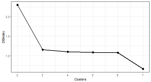
We can see that now 2 “elbows” appeared. The biggest change is between 2 and 3 number of clusters, so I will choose number 3.
1 | |
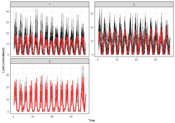
It seems like good separability of clusters, better than in the case of DFT. But you can check also other results of clusterings with the different number of clusters.
Conclusion
In this tutorial, I showed you the usage of time series representation methods to create more characteristic profiles of consumers. Then, time series representations, calculated by TSrepr package, were clustered by K-medoids and typical consumption profiles were extracted from created clusters.
Time series representations can be helpful also in other use cases as classification or time series indexing. You can check how I use time series representations in my dissertation thesis in more detail on the research section of this site.
References
Laurinec, Peter, and Mária Lucká. 2016. “Comparison of Representations of Time Series for Clustering Smart Meter Data.” In Lecture Notes in Engineering and Computer Science: Proceedings of the World Congress on Engineering and Computer Science 2016, 458–63.
Laurinec, Peter, Marek Lóderer, Petra Vrablecová, Mária Lucká, Viera Rozinajová, and Anna Bou Ezzeddine. 2016. “Adaptive Time Series Forecasting of Energy Consumption Using Optimized Cluster Analysis.” In Data Mining Workshops (Icdmw), 2016 Ieee 16th International Conference on, 398–405. IEEE.