After blogging break caused by writing research papers, I managed to secure time to write something new about time series forecasting. This time I want to share with you my experiences with seasonal-trend time series forecasting using simple regression trees. Classification and regression tree (or decision tree) is broadly used machine learning method for modeling. They are favorite because of these factors:
-
simple to understand (white box)
-
from a tree we can extract interpretable results and make simple decisions
-
they are helpful for exploratory analysis as binary structure of tree is simple to visualize
-
very good prediction accuracy performance
-
very fast
-
they can be simply tuned by ensemble learning techniques
But! There is always some “but”, they poorly adapt when new unexpected situations (values) appears. In other words, they can not detect and adapt to change or concept drift well (absolutely not). This is due to the fact that tree creates during learning just simple rules based on training data. Simple decision tree does not compute any regression coefficients like linear regression, so trend modeling is not possible. You would ask now, so why we are talking about time series forecasting with regression tree together, right? I will explain how to deal with it in more detail further in this post.
You will learn in this post how to:
-
decompose double-seasonal time series
-
detrend time series
-
model and forecast double-seasonal time series with trend
-
use two types of simple regression trees
-
set important hyperparameters related to regression tree
Exploring time series data of electricity consumption
As in previous posts, I will use smart meter data of electricity consumption for demonstrating forecasting of seasonal time series. I created a new dataset of aggregated electricity load of consumers from an anonymous area. Time series data have the length of 17 weeks.
Firstly, let’s scan all of the needed packages for data analysis, modeling and visualizing.
1 | |
Now read the mentioned time series data by read_feather to one data.table. The dataset can be found on my github repo, the name of the file is DT_load_17weeks.
DT <- as.data.table(read_feather(“DT_load_17weeks”))
1 | |
n_date <- unique(DT[, date]) period <- 48
1 | |
theme_ts <- theme(panel.border = element_rect(fill = NA, colour = “grey10”), panel.background = element_blank(), panel.grid.minor = element_line(colour = “grey85”), panel.grid.major = element_line(colour = “grey85”), panel.grid.major.x = element_line(colour = “grey85”), axis.text = element_text(size = 13, face = “bold”), axis.title = element_text(size = 15, face = “bold”), plot.title = element_text(size = 16, face = “bold”), strip.text = element_text(size = 16, face = “bold”), strip.background = element_rect(colour = “black”), legend.text = element_text(size = 15), legend.title = element_text(size = 16, face = “bold”), legend.background = element_rect(fill = “white”), legend.key = element_rect(fill = “white”))
1 | |
data_train <- DT[date %in% n_date[43:63]] data_test <- DT[date %in% n_date[64]]
1 | |
averages <- data.table(value = rep(sapply(0:2, function(i) mean(data_train[((iperiod7)+1):((i+1)period7), value])), each = period * 7), date_time = data_train$date_time)
ggplot(data_train, aes(date_time, value)) + geom_line() + geom_line(data = averages, aes(date_time, value), linetype = 5, alpha = 0.75, size = 1.2, color = “firebrick2”) + labs(x = “Date”, y = “Load (kW)”) + theme_ts
1 | |
data_ts <- ts(data_train$value, freq = period * 7) decomp_ts <- stl(data_ts, s.window = “periodic”, robust = TRUE)$time.series
decomp_stl <- data.table(Load = c(data_train$value, as.numeric(decomp_ts)), Date = rep(data_train[,date_time], ncol(decomp_ts)+1), Type = factor(rep(c(“original data”, colnames(decomp_ts)), each = nrow(decomp_ts)), levels = c(“original data”, colnames(decomp_ts))))
ggplot(decomp_stl, aes(x = Date, y = Load)) + geom_line() + facet_grid(Type ~ ., scales = “free_y”, switch = “y”) + labs(x = “Date”, y = NULL, title = “Time Series Decomposition by STL”) + theme_ts
1 | |
Now use fourier function using two conditions for a number of K terms.
Set K for example just to 2.
1 | |
It made 2 pairs (sine and cosine) of daily and weekly seasonal signals. If we compare it with approach described in previous posts, so simple periodic vectors, it looks like this:
1 | |
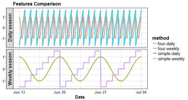
where four-daily is the Fourier term for daily season, simple-daily is the simple feature for daily season, four-weekly is the Fourier term for weekly season, and simple-weekly is the simple feature for weekly season. The advantage of Fourier terms is that there is much more closeness between ending and starting of a day or a week, which is more natural.
Now, let’s use data from STL decomposition to forecast trend part of time series. I will use auto.arima procedure from the forecast package to perform this.
1 | |
Let’s plot it:
1 | |
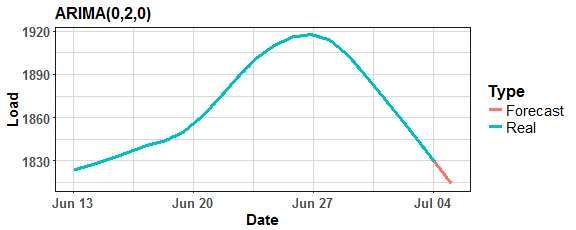
Function auto.arima chose ARIMA(0,2,0) model as best for trend forecasting.
Next, make the final feature to the model (lag) and construct train matrix (model matrix). I am creating lag by one day and just taking seasonal part from STL decomposition (for having smooth lag time series feature).
1 | |
The accuracy of forecast (or fitted values of a model) will be measured by MAPE, let’s defined it:
1 | |
RPART (CART) tree
In the next two sections, I will describe two regression tree methods. The first is RPART, or CART (Classification and Regression Trees), the second will be CTREE. RPART is recursive partitioning type of binary tree for classification or regression tasks. It performs a search over all possible splits by maximizing an information measure of node impurity, selecting the covariate showing the best split.
I’m using rpart implementation from the same named package. Let’s go forward to modeling and try default settings of rpart function:
tree_1 <- rpart(Load ~ ., data = matrix_train)
1 | |
Lag C2-48 C1-336 S1-48 C1-48 S1-336 C2-336
100504751 45918330 44310331 36245736 32359598 27831258 25385506
S2-336 S2-48
15156041 7595266
paste(“Number of splits: “, tree_1$cptable[dim(tree_1$cptable)[1], “nsplit”])
[1] “Number of splits: 10”
1 | |
rpart.plot(tree_1, digits = 2, box.palette = viridis::viridis(10, option = “D”, begin = 0.85, end = 0), shadow.col = “grey65”, col = “grey99”)
1 | |
datas <- data.table(Load = c(matrix_train$Load, predict(tree_1)), Time = rep(1:length(matrix_train$Load), 2), Type = rep(c(“Real”, “RPART”), each = length(matrix_train$Load)))
ggplot(datas, aes(Time, Load, color = Type)) + geom_line(size = 0.8, alpha = 0.75) + labs(y = “Detrended load”, title = “Fitted values from RPART tree”) + theme_ts
1 | |
Whups. It’s a little bit simple (rectangular) and not really accurate, but it’s logical result from a simple tree model.
The key to achieving better results and have more accurate fit is to set manually control hyperparameters of rpart.
Check ?rpart.control to get more information.
The “hack” is to change cp (complexity) parameter to very low to produce more splits (nodes). The cp is a threshold deciding if each branch fulfills conditions for further processing, so only nodes with fitness larger than factor cp are processed. Other important parameters are the minimum number of observations in needed in a node to split (minsplit) and the maximal depth of a tree (maxdepth).
Set the minsplit to 2 and set the maxdepth to its maximal value - 30.
1 | |
Now make simple plot to see depth of the created tree…
plot(tree_2, compress = TRUE)
1 | |
600 is higher than 10 :)
Let’s plot fitted values from the model tree_2:
1 | |
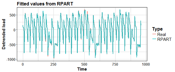
And see the error of fitted values against real values.
mape(matrix_train$Load, predict(tree_2))
[1] 16.0639
1 | |
test_lag <- decomp_ts[((period*window)+1):N, 1] fuur_test <- fourier(data_msts, K = c(K, K), h = period)
matrix_test <- data.table(fuur_test, Lag = test_lag)
1 | |
Let’s plot the results and compare it with real values from data_test.
1 | |
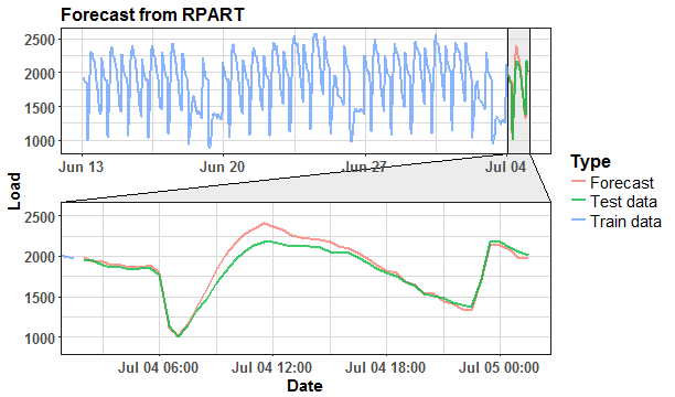
Not bad. For clarity, compare forecasting results with model without separate trend forecasting and detrending.
1 | |
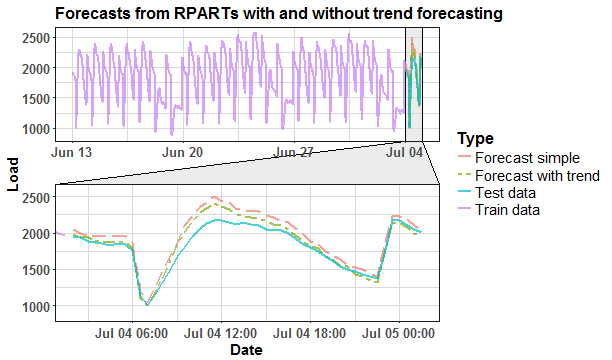
We can see that RPART model without trend manipulation has higher values of the forecast. Evaluate results with MAPE forecasting measure.
mape(data_test$value, for_rpart)
[1] 3.727473
mape(data_test$value, for_rpart_sim)
[1] 6.976259
1 | |
Constructed tree can be again simply plotted by plot function, but it made many splits so it’s disarranged.
Let’s plot fitted values from ctree_1 model.
1 | |
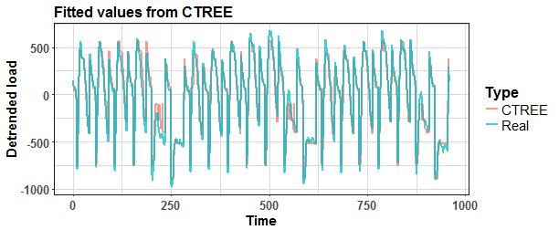
And see the error of fitted values against real values.
mape(matrix_train$Load, predict(ctree_1))
[1] 87.85983
1 | |
ctree_2 <- ctree(Load ~ ., data = matrix_train, controls = party::ctree_control(teststat = “quad”, testtype = “Teststatistic”, mincriterion = 0.925, minsplit = 1, minbucket = 1))
datas <- data.table(Load = c(matrix_train$Load, predict(ctree_2)), Time = rep(1:length(matrix_train$Load), 2), Type = rep(c(“Real”, “CTREE”), each = length(matrix_train$Load)))
ggplot(datas, aes(Time, Load, color = Type)) + geom_line(size = 0.8, alpha = 0.75) + labs(y = “Detrended load”, title = “Fitted values from CTREE”) + theme_ts
1 | |
It’s better. Now forecast values with ctree_2 model.
for_ctree <- predict(ctree_2, matrix_test) + trend_for
1 | |
data_for <- data.table(Load = c(data_train$value, data_test$value, for_rpart, for_ctree), Date = c(data_train$date_time, rep(data_test$date_time, 3)), Type = c(rep(“Train data”, nrow(data_train)), rep(“Test data”, nrow(data_test)), rep(“RPART”, nrow(data_test)), rep(“CTREE”, nrow(data_test))))
ggplot(data_for, aes(Date, Load, color = Type, linetype = Type)) + geom_line(size = 0.8, alpha = 0.7) + facet_zoom(x = Date %in% data_test$date_time, zoom.size = 1.2) + labs(title = “Forecasts from RPART and CTREE models”) + scale_linetype_manual(values = c(5,6,1,1)) + theme_ts
1 | |
Slightly better MAPE value with RPART, but again now it can not be anything to generalize. You can read more about CTREE method in its great package vignette. Try to forecast future values with all available electricity load data with sliding window approach (window of the length of three weeks) for a period of more than three months (98 days).
Comparison
Define functions that produce forecasts, so add up everything that we learned so far.
1 | |
I created plotly boxplots graph of MAPE values from four models - CTREE simple, CTREE with detrending, RPART simple and RPART with detrending. Whole evaluation can be seen in the script that is stored in my GitHub repository.
We can see that detrending time series of electricity consumption improves the accuracy of the forecast with the combination of both regression tree methods - RPART and CTREE. My approach works as expected.
The habit of my posts is that animation must appear. So, I prepared for you two animations (animated dashboards) using animation, grid, ggplot and ggforce (for zooming) packages that visualize results of forecasting.
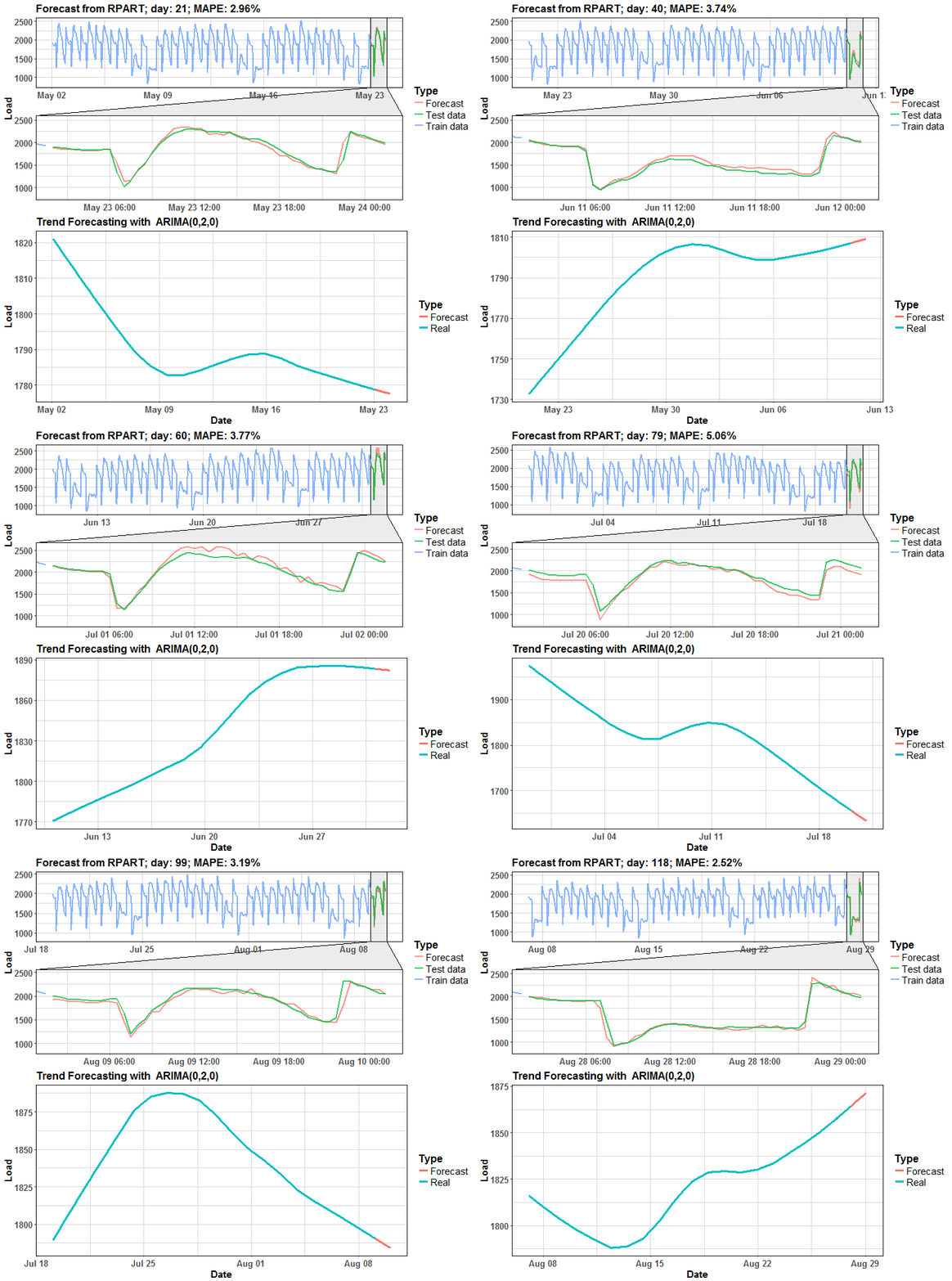
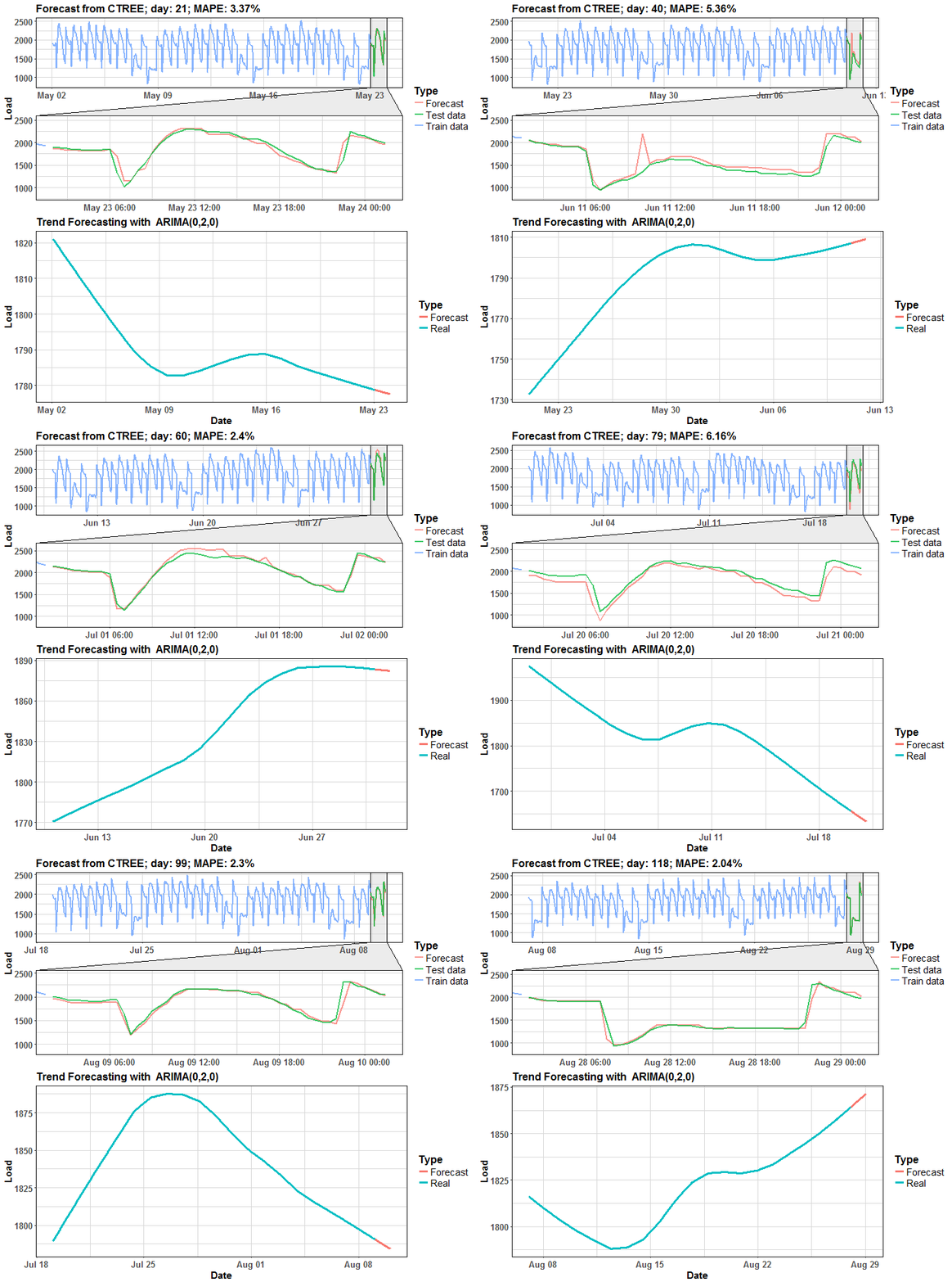
We can see that in many days it is almost perfect forecast, but on some days it has some potential for improving.
Conclusion
In this post, I showed you how to solve trend appearance in seasonal time series with using a regression tree model. Detrending time series for regression tree methods is a important (must) procedure due to the character of decision trees. The trend part of a time series was acquired by STL decomposition and separately forecasted by a simple ARIMA model. I evaluated this approach on the dataset from smart meters measurements of electricity consumption. The regression (decision) tree is a great technique for getting simple and interpretable results in very fast computational time.
In the future post, I will focus on enhancing the predictive performance of simple regression tree methods by ensemble learning methods like Bagging, Random Forest, and similar.