In my last job, I was a frequent flyer. Each week I flew between 2 or 3 countries, briefly returning for 24 hours on the weekend to get a change of clothes. My favourite airlines were Cathay Pacific, Emirates and Singapore Air. Now, unless you have been living in a cave, you’d be well aware of the recent news story of how United Airlines removed David Dao from an aircraft. I wondered how that incident had affected United’s brand value, and being a data scientist I decided to do sentiment analysis of United versus my favourite airlines.
Way back on 4th July 2015, almost two years ago, I wrote a blog entitled Tutorial: Using R and Twitter to Analyse Consumer Sentiment. Even though that blog post is one of my earliest, it continues to be the most popular, attracting just as many readers per day as when I first wrote it.
Since the sentiment package, upon which that blog was based, is no longer supported by CRAN, and many readers have problems with the manual and technical process of installing an obsolete package from an archive, I have written a new blog using a different, live CRAN package. The syuzhet package was published only several weeks ago, and offers a range of different sentiment analysis models. So I’ve started to try it out.
I have collected tweets for 4 airlines:
-
Cathay Pacific
-
Emirates
-
Singapore Air
-
United Airlines
The tweet data starts at 01-Jan-2015 and go up to mid-April 2017.
Step 1: Load the tweets and load the relevant packages
I’ve stored the tweets in a dbf file and zipped it. The zip file is 68MB in size, and the dbf file is 353MB. The code shown above downloads the zip file, extracts the dbf and then reads the dbf file into a data.frame.
Step 2: Do Sentiment Scoring using the syuzhet package
The syuzhet package offers a few different algorithms, each taking a different approach to sentiment scoring. It also does emotion scoring based upon the nrc algorithm. The code above calculates scores using the syuzhet, bing, afinn and nrc algorithms, adding columns with the scores from each algorithm.
Step 3: Visualise the Sentiment Scores
The code above summarises the sentiment for each airline across time. The first plot shows the daily sentiment values for each airline:
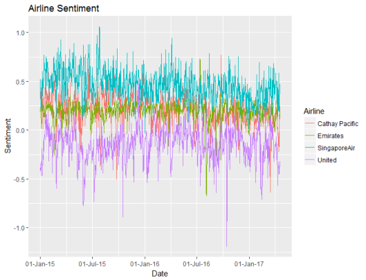
Based upon the bing sentiment algorithm, United has the poorest sentiment, and Singapore has the best sentiment. United usually has negative sentiment. Daily to day random fluctuations in sentiment make this a cluttered graph, so I decided to summarise the sentiment weekly instead of daily:
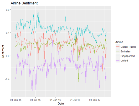
Now it’s easier to see the differences in sentiment between the four airlines. While Emirates and Cathay Pacific have similar levels of sentiment, the values for Emirates are more stable. This, however, may be due to the sheer volume of tweets about Emirates versus the smaller number of tweets about Cathay Pacific.
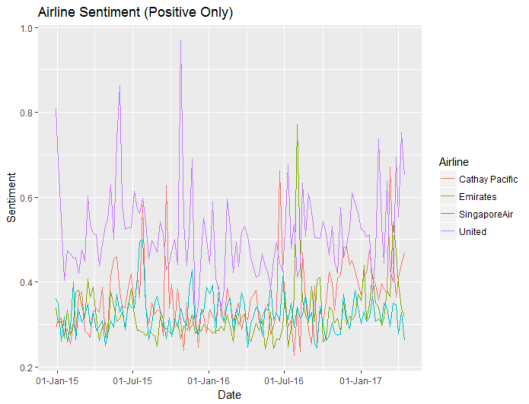
Step 4: Compare the Sentiment Algorithms
The sentiment scores above use the bing algorithm, but we should check whether the different algorithms produce different results.
The code above was a bit clumsy – I probably should have used reshape.
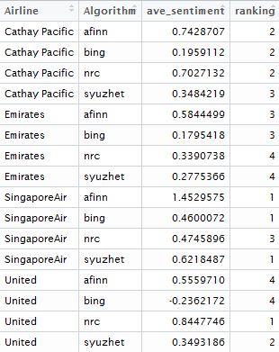
The different algorithms give similar rankings between the airlines with one big exception: the nrc algorithm is surprisingly positive about United and unusually negative about Singapore Air compared to the other algorithms. This goes to show that sentiment analysis isn’t just a plug and play technique and also means that a warning should be applied to the emotion analysis shown in Step 5 below, as it is based upon the nrc algorithm!
Step 5: Emotion Analysis
Noting the warning, from the previous section, let’s compare the emotions between the airlines and between tweets, using the nrc algorithm.
The code above plots the emotions across time for each airline.
United Airlines attracts more angry tweets, and this has spiked in April 2017 following the David Dao incident. But United Airlines also attracts more positive tweets than the other airlines. This might explain the ranking differences between the algorithms – maybe the algorithms weight positive tweets differently to negative tweets.
Then the code creates a comparison word cloud, to show the different words in airline tweets that are associated with each emotion.
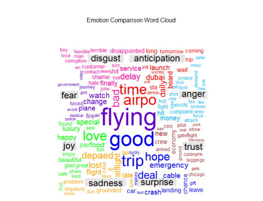
Step 6: Compare the Different Tweeting Behaviour of Different Twitter Users
Are some users more positive than others? Is this user behaviour different between the airlines? Do people who tweet more have a different sentiment to those who tweet about airlines less frequently? Are particular users dragging the average up or down? To answer these questions, I have tracked the 100 users who tweeted the most about these airlines.
Firstly let’s look at the behaviour of individual users:
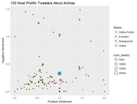
Top user sentiment is quite different by airline. Emirates has a number of frequent tweeters who are unemotional, who on average post neither positive nor negative sentiment. United Airlines attracts more emotional posts. Singapore Air and Cathay Pacific have big users that post a lot of tweets about them.
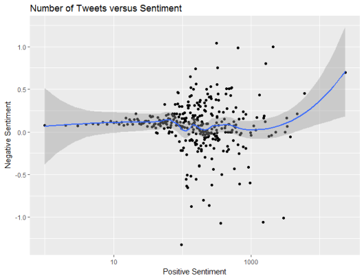
However, on average bigger frequent tweeters post a similar balance of positive and negative content to smaller users who tweet infrequently.
Step 7: Compare The Words Used to Describe Each Airline
In order to explain the differences in sentiment, we can create a word cloud that contrasts the words used in posts about each airline.
The code above is quite similar to that in the previous step, except that this time we are comparing airlines instead of emotions.
Emirates includes “aniston”, presumably in reference to the marketing campaign involving Jennifer Aniston, while United includes “CEO” due to a number of news stories about United CEO’s including a resignation and a heart transplant.
Like this:
Like Loading…
Related