I will continue in describing forecast methods, which are suitable to seasonal (or multi-seasonal) time series. In the previous post smart meter data of electricity consumption were introduced and a forecast method using similar day approach was proposed. ARIMA and exponential smoothing (common methods of time series analysis) were used as forecast methods. The biggest disadvantage of this approach was that we created multiple models at once for different days in the week, which is computationally expensive and it can be a little bit unclear. Regression methods are more suitable for multi-seasonal times series. They can handle multiple seasonalities through independent variables (inputs of a model), so just one model is needed. In this post, I will introduce the most basic regression method - multiple linear regression (MLR).
I have prepared a file with four aggregated time series for analysis and forecast. It can be found on my github repo, the name of the file is DT_4_ind. Of course, I’m using EnerNOC smart meter data again and time series were aggregated by four located industries. The file was created easily by the package feather (CRAN link), so only by this package, you can read this file again. The feather is a useful tool to share data for R and Python users.
Data manipulation will be done by data.table package, visualizations by ggplot2, plotly and animation packages.
The first step to do some “magic” is to scan all of the needed packages.
1 | |
Read the mentioned smart meter data by read_feather to one data.table.
DT <- as.data.table(read_feather(“DT_4_ind”))
1 | |
ggplot(data = DT, aes(x = date, y = value)) + geom_line() + facet_grid(type ~ ., scales = “free_y”) + theme(panel.border = element_blank(), panel.background = element_blank(), panel.grid.minor = element_line(colour = “grey90”), panel.grid.major = element_line(colour = “grey90”), panel.grid.major.x = element_line(colour = “grey90”), axis.text = element_text(size = 10), axis.title = element_text(size = 12, face = “bold”), strip.text = element_text(size = 9, face = “bold”)) + labs(x = “Date”, y = “Load (kW)”)
1 | |
Store informations in variables of the type of industry, date, weekday and period.
1 | |
Let’s look at some data chunk of consumption and do regression analysis on it. I have picked aggregate consumption of education (schools) buildings for two weeks. Store it in variable data_r and plot it.
1 | |
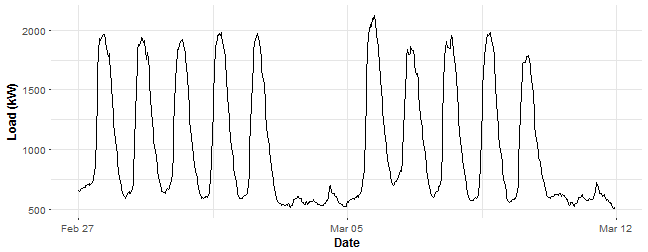
Let’s now create the mentioned independent dummy variables and store all of them in the matrix_train. When we are using the method lm in R, it’s simple to define dummy variables in one vector. Just use as.factor for some vector of classes. We don’t need to create 48 vectors for daily dummy variables and 6 vectors for weekly dummy variables.
1 | |
Let’s create our first multiple linear model with the function lm. lm automatically add to the linear model intercept, so we must define it now 0. Also, we can simply put all the variables to the model just by the dot - ..
lm_m_1 <- lm(Load ~ 0 + ., data = matrix_train)
1 | |
You can see a nice summary of the linear model, stored in the variable lm_m_1, but I will omit them now because of its long length (we have 54 variables). So I’m showing you only the two most important statistics: R-squared and p-value of F-statistic of the goodness of fit. They seem pretty good.
Let’s look at the fitted values.
1 | |
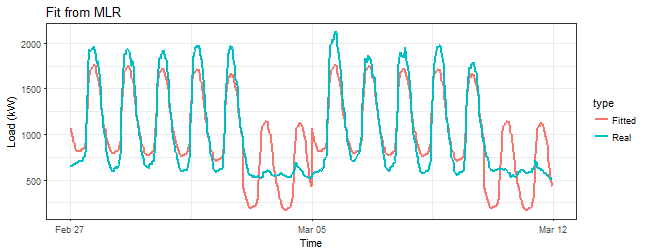
That’s horrible! Do you see that bad fit around 5th March (weekend)? We are missing something here.
Look at the fitted values vs. residuals now.
1 | |
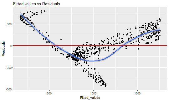
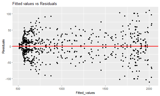
This is the typical example of heteroskedasticity - occurrence of nonconstant residuals (variance) in a regression model. The linear regression has an assumption that residuals must be from ( N(0,~\sigma^2) ) distribution and they are i.i.d. In the other words, the residuals must be symmetrically around zero.
Let’s look at the next proof that our residuals are not normal. We can use normal Q-Q plot here. I’m using the function from this stackoverflow question to plot it by ggplot2.
1 | |
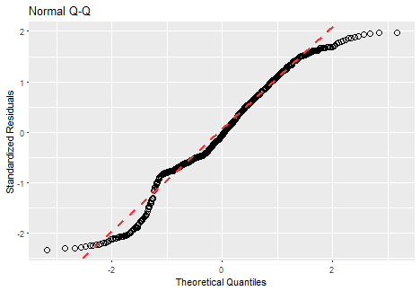
Of course, it is absolutely not normal (points must be close the red line).
What can we do now? Use other regression methods (especially nonlinear ones)? No. Let’s think about why this happened. We have seen on fitted values, that measurements during the day were moved constantly by the estimated coefficient of week variable, but the behavior during the day wasn’t captured. We need to capture this behavior because especially weekends behave absolutely different. It can be handled by defining interactions between day and week dummy variables to the regression model. So we multiply every daily variable with every weekly one. Again, be careful with collinearity and singularity of the model matrix, so we must omit one daily dummy variable (for example ( d_{1} )). Fortunately, this is done in method lm automatically, when we use factors as variables.
Let’s train a second linear model. Interactions should solve the problem, that we saw in the plot of fitted values.
1 | |
Look at R-squared of previous model and the new one with interactions:
c(Previous = summary(lm_m_1)$r.squared, New = summary(lm_m_2)$r.squared)
1 | |
R-squared seems better.
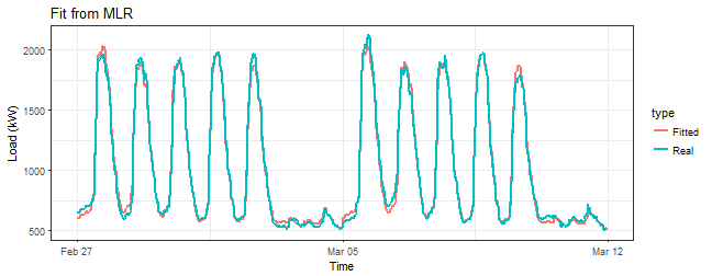
Look at the comparison of residuals of two fitted models. Using the interactive plot plotly here.
1 | |
This is much better than the previous model, it seems that interactions are working.
Prove it with a sequence of three plots - fitted values, fit vs. residuals and Q-Q plot.
1 | |
1 | |
ggQQ(lm_m_2)
1 | |
predWeekReg <- function(data, set_of_date){
# Subsetting the dataset by dates data_train <- data[date %in% set_of_date]
N <- nrow(data_train) window <- N / period # number of days in the train set # 1, …, period, 1, …, period - and so on for the daily season # Using feature “week_num” for the weekly season matrix_train <- data.table(Load = data_train[, value], Daily = as.factor(rep(1:period, window)), Weekly = as.factor(data_train[, week_num]))
# Creation of the model lm_m <- lm(Load ~ 0 + Daily + Weekly + Daily:Weekly, data = matrix_train)
# Creation of the forecast for one week ahead pred_week <- predict(lm_m, matrix_train[1:(7*period), -1, with = FALSE])
return(as.vector(pred_week)) }
1 | |
mape <- function(real, pred){ return(100 * mean(abs((real - pred)/real))) }
1 | |
n_weeks <- floor(length(n_date)/7) - 2
Forecasts
lm_pred_weeks_1 <- sapply(0:(n_weeks-1), function(i) predWeekReg(DT[type == n_type[1]], n_date[((i7)+1):((i7)+7*2)]))
lm_pred_weeks_2 <- sapply(0:(n_weeks-1), function(i) predWeekReg(DT[type == n_type[2]], n_date[((i7)+1):((i7)+7*2)]))
lm_pred_weeks_3 <- sapply(0:(n_weeks-1), function(i) predWeekReg(DT[type == n_type[3]], n_date[((i7)+1):((i7)+7*2)]))
lm_pred_weeks_4 <- sapply(0:(n_weeks-1), function(i) predWeekReg(DT[type == n_type[4]], n_date[((i7)+1):((i7)+7*2)]))
Evaluation (computation of errors)
lm_err_mape_1 <- sapply(0:(n_weeks-1), function(i) mape(DT[(type == n_type[1] & date %in% n_date[(15+(i7)):(21+(i7))]), value], lm_pred_weeks_1[, i+1]))
lm_err_mape_2 <- sapply(0:(n_weeks-1), function(i) mape(DT[(type == n_type[2] & date %in% n_date[(15+(i7)):(21+(i7))]), value], lm_pred_weeks_2[, i+1]))
lm_err_mape_3 <- sapply(0:(n_weeks-1), function(i) mape(DT[(type == n_type[3] & date %in% n_date[(15+(i7)):(21+(i7))]), value], lm_pred_weeks_3[, i+1]))
lm_err_mape_4 <- sapply(0:(n_weeks-1), function(i) mape(DT[(type == n_type[4] & date %in% n_date[(15+(i7)):(21+(i7))]), value], lm_pred_weeks_4[, i+1]))
1 | |
datas <- data.table(value = c(as.vector(lm_pred_weeks_1), DT[(type == n_type[1]) & (date %in% n_date[-c(1:14,365)]), value]), date_time = c(rep(DT[-c(1:(1448), (17473:nrow(DT))), date_time], 2)), type = c(rep(“MLR”, nrow(lm_pred_weeks_1)ncol(lm_pred_weeks_1)), rep(“Real”, nrow(lm_pred_weeks_1)*ncol(lm_pred_weeks_1))), week = c(rep(1:50, each = 336), rep(1:50, each = 336)))
saveGIF({ oopt = ani.options(interval = 0.9, nmax = 50) for(i in 1:ani.options(“nmax”)){ print(ggplot(data = datas[week == i], aes(date_time, value, group = type, colour = type)) + geom_line(size = 0.8) + scale_y_continuous(limits = c(min(datas[, value]), max(datas[, value]))) + theme(panel.border = element_blank(), panel.background = element_blank(), panel.grid.minor = element_line(colour = “grey90”), panel.grid.major = element_line(colour = “grey90”), panel.grid.major.x = element_line(colour = “grey90”), title = element_text(size = 15), axis.text = element_text(size = 10), axis.title = element_text(size = 12, face = “bold”)) + labs(x = “Time”, y = “Load (kW)”, title = paste(“Forecast of MLR (“, n_type[1], “); “, “week: “, i, “; MAPE: “, round(lm_err_mape_1[i], 2), “%”, sep = “”))) ani.pause()
}}, movie.name = “industry_1.gif”, ani.height = 450, ani.width = 750)
```
Here are the created GIFs:
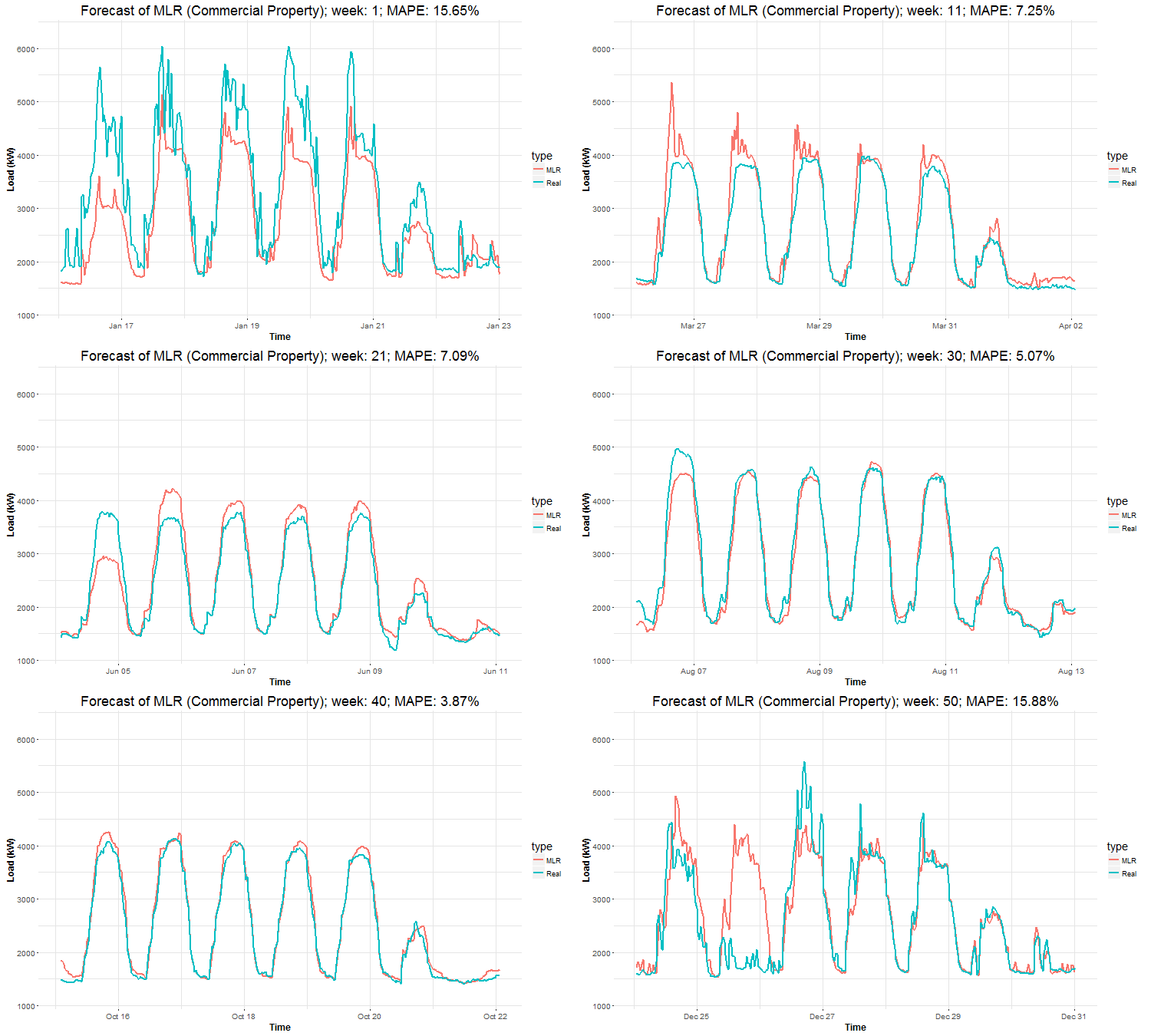
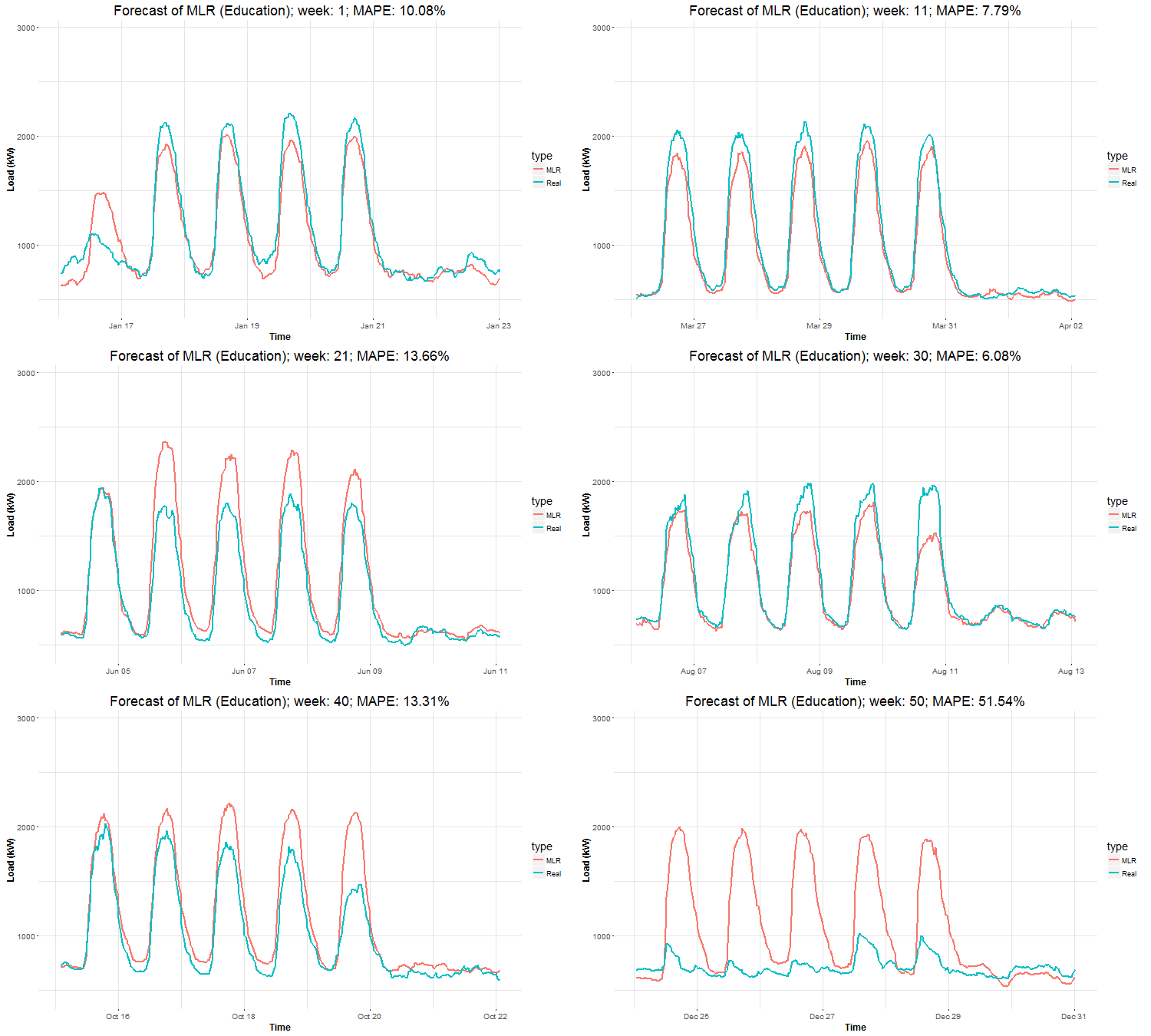
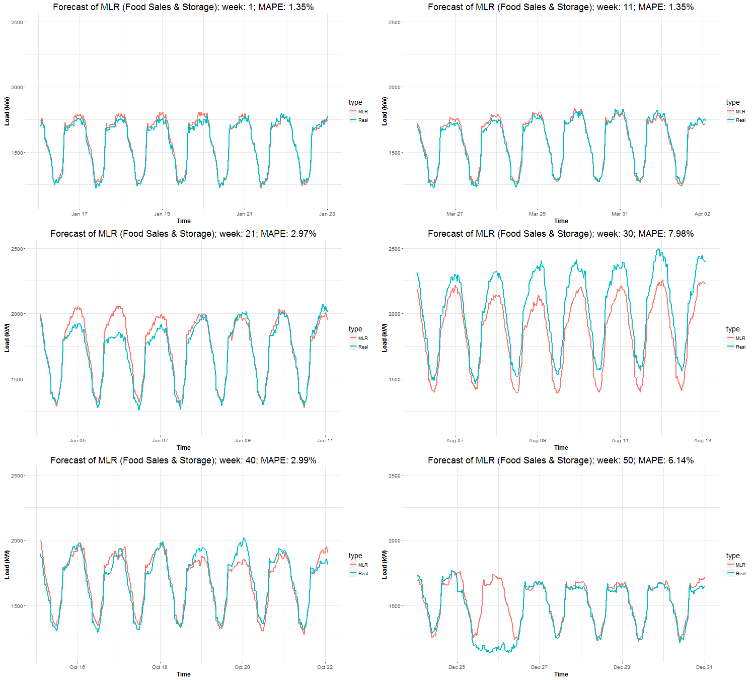
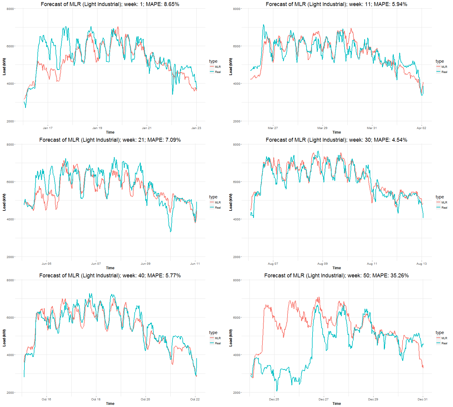
In these animations we can see that the behavior of the electricity consumption can be very stochastic and many external factors influence it (holidays, weather etc.), so it’s a challenging task.
The aim of this post was to introduce most basic regression method, MLR, for forecasting double seasonal time series. By use of the regression analysis, we showed that inclusion of interactions of independent variables to the model can be very effective. This analysis then implies that the forecast accuracy of MLR was much better than with STL+ARIMA method.
In my next post, I will continue with the introduction of regression methods, this time with GAM (Generalized Additive Model).
Script for the creation of this whole post can be found on my github repo.