Deployment of smart grids gives space to an occurrence of new methods of machine learning and data analysis. Smart grids can contain of millions of smart meters, which produce a large amount of data of electricity consumption (long time series). In addition to time series of electricity consumption, we can have extra information about the consumer like ZIP code, type of consumer (consumer vs. prosumer) and so on. These data can be used to support intelligent grid control, make an accurate forecast or to detect anomalies. In this blog post, I will focus on the exploration of available open smart meter data and on the creation of a simple forecast model, which uses similar day approach (will be drawn up in detail below).
Firstly, we must download smart meter data of electricity consumption. These data can be downloaded from the site open enernoc data. This dataset was produced by the EnerNOC company and consists of 100 anonymized commercial buildings for 2012. The dataset contains time series of 100 consumers and theirs corresponding meta data. Let’s download the all-data.tar.gz file and explore it.
Exploring meta data of consumers (IDs)
I will do every reading and filtering (cleaning) of the dataset by means of the awesome package data.table. As you may already know, with data.table you can change dataset by reference (:= or set), which is very effective. You can do similar things with package dplyr, but I prefer data.table, because of performance and memory usage. An interesting comparison of both packages can be seen on this stackoverflow question. To visualize interesting relations, I will use package ggplot2. Manipulation with date and time can be done easily by package lubridate.
So…I hope I haven’t forgotten something, go ahead to the programming and exploration part of this post. First step - scan all of the needed packages.
1 | |
Read the meta data by function fread and show their structure. Of course, you must firstly set your working directory by setwd("YOUR PATH"), where smart meter data are situated.
1 | |
Classes ‘data.table’ and ‘data.frame’:100 obs. of 8 variables:
$ SITE_ID : int 6 8 9 10 12 13 14 21 22 25 …
$ INDUSTRY : chr “Commercial Property” “Commercial Property” “Commercial Property” “Commercial Property” …
$ SUB_INDUSTRY: chr “Shopping Center/Shopping Mall” “Shopping Center/Shopping Mall” “Corporate Office” “Shopping Center/Shopping Mall” …
$ SQ_FT : int 161532 823966 169420 1029798 179665 185847 1675720 783982 318130 1807149 …
$ LAT : num 34.8 40.3 40.9 39.7 39.7 …
$ LNG : num -106.9 -76.4 -74.7 -75 -74.9 …
$ TIME_ZONE : chr “America/Denver” “America/New_York” “America/New_York” “America/New_York” …
$ TZ_OFFSET : chr “-06:00” “-04:00” “-04:00” “-04:00” …
- attr(*, “.internal.selfref”)=
1 | |
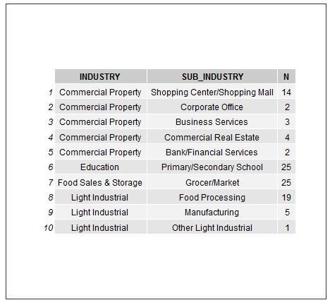
Plot to table:
1 | |
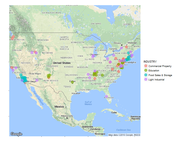
With the package ggmap it is easy to map location of our consumers to the map of USA. Let’s split them by industries.
1 | |
Now look at the SQ_FT feature. Firstly, I transform square feets to square meters (I am an European…). Histogram of SQ_M of buildings.
1 | |
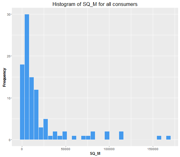
Looks like we have a majority of buildings under 20,000 ( m^2 ).
Let’s do something similar, but now do density plot for our 4 industries separately.
1 | |
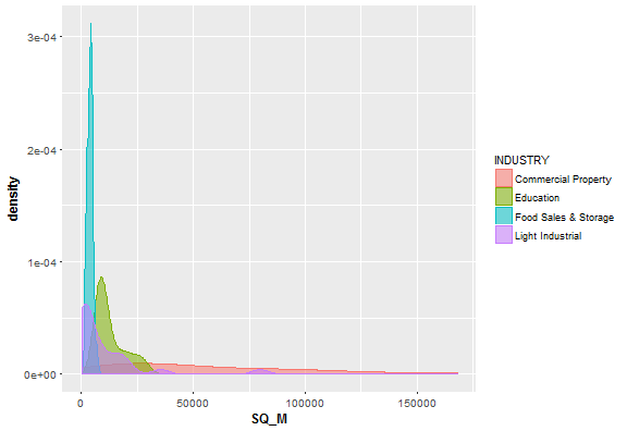
Looks like Food Sales & Storage buildings have relatively small size. On the other hand, Commercial Property buildings have very variable size.
Now try to combine meta data with real electricity consumption data and see interesting relations between them.
Load all .csv files containing electricity consumption in one data.table by functions rbindlist and lapply. See the structure of these data and change the column names. V2 to ID and dttm_utc to date.
1 | |
Classes ‘data.table’ and ‘data.frame’:10531288 obs. of 6 variables:
$ timestamp: int 1325376600 1325376900 1325377200 1325377500 1325377800 1325378100 1325378400 1325378700 1325379000 1325379300 …
$ dttm_utc : chr “2012-01-01 00:10:00” “2012-01-01 00:15:00” “2012-01-01 00:20:00” “2012-01-01 00:25:00” …
$ value : num 106 105 102 103 102 …
$ estimated: int 0 0 0 0 0 0 0 0 0 0 …
$ anomaly : chr “” “” “” “” …
$ V2 : chr “10” “10” “10” “10” …
- attr(*, “.internal.selfref”)=
setnames(DT, c(“dttm_utc”, “V2”), c(“date”, “ID”))
1 | |
meta_data[, ‘:=’(TIME_ZONE = NULL, TZ_OFFSET = NULL)] setnames(meta_data, “SITE_ID”, “ID”) meta_data[, ID := as.character(meta_data[[“ID”]])]
1 | |
ID_stats <- DT[, .(Mean = mean(value), Median = median(value), Sum = sum(value)), .(ID)]
1 | |
data_m <- merge(ID_stats, meta_data, by = “ID”) sub_sum <- data_m[, .(mean(Mean)), .(SUB_INDUSTRY)]
1 | |
ggplot(sub_sum, aes(x = reorder(SUB_INDUSTRY, V1), y = V1, fill = reorder(SUB_INDUSTRY, V1))) + geom_bar(stat = “identity”, width = 0.8) + labs(x = “”, y = “Mean Load (kW)”, title = “Mean load by subindustries”, fill = “SUB_INDUSTRY”) + theme(title = element_text(size = 14), axis.text = element_text(size = 10), axis.title = element_text(size = 12, face = “bold”), axis.text.x = element_blank(), axis.ticks.x = element_blank())
1 | |
ggplot(data_m[, .(SQ_M, Median, INDUSTRY)], aes(x = SQ_M, y = Median)) + geom_point(aes(colour = INDUSTRY, shape = INDUSTRY), size = 4, alpha = 0.8) + geom_smooth(method = lm, color = “yellow1”, se = TRUE) + scale_shape_manual(values = c(15,16,17,18)) + scale_color_manual(values=c(“salmon”, “dodgerblue2”, “springgreen3”, “plum3”)) + theme(axis.text=element_text(size=10), axis.title=element_text(size=12,face=”bold”))
1 | |
Prepare dataset to forecast and explore time series of load
Let’s do the must changes to construct our forecast model. Transform characters of date to classical date and date format (POSIXct). Remove the useless columns and look at structure of current dataset, which is full of time series.
1 | |
Classes ‘data.table’ and ‘data.frame’:10531288 obs. of 4 variables:
$ date : Date, format: “2012-01-01” “2012-01-01” …
$ value : num 106 105 102 103 102 …
$ ID : chr “10” “10” “10” “10” …
$ date_time: POSIXct, format: “2012-01-01 00:10:00” “2012-01-01 00:15:00” …
- attr(*, “.internal.selfref”)=
1 | |
count_ID <- DT[, .N, ID] full <- count_ID[N == max(N), .(ID)] DT <- DT[ID %in% full[, ID]] nrow(full) # number of extracted IDs
[1] 43
1 | |
[1] “100” “101” “103” “116” “14” “144” “153” “197” “213” “218” “228”
[12] “236” “259” “275” “281” “285” “304” “31” “339” “341” “366” “384”
[23] “386” “391” “401” “455” “474” “475” “496” “512” “56” “65” “716”
[34] “718” “731” “761” “765” “766” “832” “88” “9” “92” “99”
1 | |
num_date <- DT[ID == 100, .N, .(date)] num_date
1 | |
##
1 287 288
1 1 365
DT <- DT[!date %in% num_date[c(1,367), date]]
1 | |
ggplot(DT[ID == 99, .(value, date)], aes(date, value)) + geom_line() + theme(panel.border = element_blank(), panel.background = element_blank(), panel.grid.minor = element_line(colour = “grey90”), panel.grid.major = element_line(colour = “grey90”), panel.grid.major.x = element_line(colour = “grey90”), axis.text = element_text(size = 10), axis.title = element_text(size = 12, face = “bold”), strip.text = element_text(size = 12, face = “bold”)) + labs(x = “Date”, y = “Load (kW)”)
1 | |
DT_48 <- DT[, .(value = sum(value), date, ID, date_time), by = (seq(nrow(DT)) - 1) %/% 6] DT_48 <- DT_48[seq(1, nrow(DT_48), by = 6)] DT_48[, seq := NULL]
1 | |
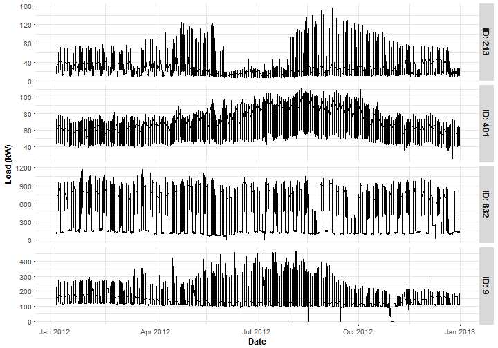
Plot typical representants of 4 groups of sub-industries. ID 213 is from the Primary/Secondary School segment, ID 401 is the Grocer/Market, ID 832 is the Corporate Office and ID 9 is the Manufactory.
1 | |
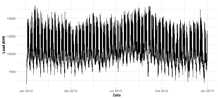
Forecast of electricity consumption, in practice, is mainly done for some area of consumers. So aggregate (cumulative) consumption is used. Aggregate it for all our consumers (43) and plot it.
1 | |
For utility (distribution) companies it is very helpful to create daily profiles of consumers or daily profiles for some area. It deals with characteristic behavior of consumer during the day. So let’s create median daily profile of aggregate consumption with MAD (median absolute deviation). I use medians and MAD because of theirs robustness.
1 | |
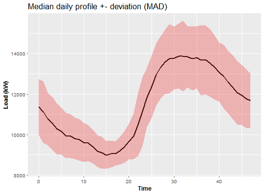
Looks like the biggest peak of the load is during the evening.
Similarly, we can do this now with week pattern. So let’s make median weekly profile of aggregate consumption with MAD.
1 | |
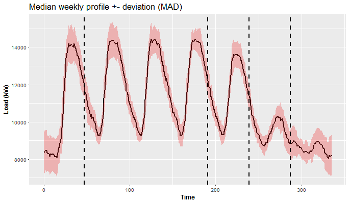
This is a much more interesting plot than the previous one, isn’t it? We can see 5 different patterns (separated by vertical lines) in behavior of the consumers during the week. From Monday till Friday the consumption is quite similar, but Monday starts with low consumption (because of the weekend), so it’s different than others. Friday has a similar pattern, but consumption is a little bit lower than on Thursday. It is obvious that weekend is absolutely different than workdays. Thereto Saturday and Sunday are different too.
Creation of forecast model for different days during the week (similar day approach)
As we have seen in the previous plot (plots), a forecast of time series of electricity consumption will be a challenging task. We have 2 main seasonalities - daily and weekly. So it is necessary to adapt the forecast model to this problem. One of the ideas to overcome this problem is to use a similar day approach - separate forecast models for groups of days.
Let’s prepare data and define all functions to achieve this goal. Add corresponding weekdays to date for datasets DT_48 and DT_agg.
1 | |
[1] “Monday” “Tuesday” “Wednesday” “Thursday” “Friday” “Saturday”
[7] “Sunday”
1 | |
n_ID <- unique(DT_48[, ID]) n_weekdays <- unique(DT_agg[, week]) n_date <- unique(DT_agg[, date]) period <- 48
1 | |
STL + ARIMA
stlARIMAPred <- function(Y, period = 48){ ts_Y <- ts(Y, start = 0, freq = period) dekom <- stl(ts_Y, s.window = “periodic”, robust = TRUE) arima <- forecast(dekom, h = period, method = “arima”) return(as.vector(arima$mean)) }
STL + EXP
stlEXPPred <- function(Y, period = 48){ ts_Y <- ts(Y, start = 0, freq = period) dekom <- stl(ts_Y, s.window = “periodic”, robust = TRUE) expo <- forecast(dekom, h = period, method = “ets”, etsmodel = “ZZN”) return(as.vector(expo$mean)) }
1 | |
mape <- function(real, pred){ return(100 * mean(abs((real - pred)/real))) }
1 | |
predictWeek <- function(data, set_of_date, FUN, train_win = 6){
for_mon <- FUN(data[(week == n_weekdays[1] & date %in% set_of_date), value]) seq_tuethu <- data[(week %in% n_weekdays[2:4] & date %in% set_of_date), value] for_tuethu <- as.vector(sapply(2:0, function(j) FUN(seq_tuethu[(length(seq_tuethu)-(periodj)+1-(train_winperiod)):(length(seq_tuethu)-(period*j))]))) for_fri <- FUN(data[(week == n_weekdays[5] & date %in% set_of_date), value]) for_sat <- FUN(data[(week == n_weekdays[6] & date %in% set_of_date), value]) for_sun <- FUN(data[(week == n_weekdays[7] & date %in% set_of_date), value])
return(c(for_mon, for_tuethu, for_fri, for_sat, for_sun)) }
1 | |
for_week_arima <- predictWeek(DT_agg, n_date[56:84], stlARIMAPred) # forecast for one week for_week_exp <- predictWeek(DT_agg, n_date[56:84], stlEXPPred) real_week <- DT_agg[date %in% n_date[85:91], value] # real consumption c(ARIMA = mape(real_week, for_week_arima), EXP = mape(real_week, for_week_exp))
1 | |
Not so bad, actually very accurate.
Compute MAPE for every day of the week separately - for better analysis.
sapply(0:6, function(i) mape(real_week[((iperiod)+1):((i+1)period)], for_week_arima[((iperiod)+1):((i+1)period)]))
[1] 3.649075 2.869293 5.301543 4.731049 4.334487 2.584994 3.104161
sapply(0:6, function(i) mape(real_week[((iperiod)+1):((i+1)period)], for_week_exp[((iperiod)+1):((i+1)period)]))
[1] 5.172147 3.931334 5.680406 7.224436 4.688619 3.281471 3.716090
1 | |
datas <- data.table(value = c(for_week_arima, for_week_exp, DT_agg[date %in% n_date[78:91], value]), date = c(rep(DT_agg[date %in% n_date[85:91], date_time], 2), DT_agg[date %in% n_date[78:91], date_time]), type = c(rep(“ARIMA”, period7), rep(“EXP”, period7), rep(“REAL”, period*14)))
ggplot(data = datas, aes(date, value, group = type, colour = type)) + geom_line(size = 0.8) + theme(panel.border = element_blank(), panel.background = element_blank(), panel.grid.minor = element_line(colour = “grey90”), panel.grid.major = element_line(colour = “grey90”), panel.grid.major.x = element_line(colour = “grey90”), title = element_text(size = 14), axis.text = element_text(size = 10), axis.title = element_text(size = 12, face = “bold”)) + labs(x = “Time”, y = “Load (kW)”, title = “Comparison of forecasts from two models”)
1 | |
for_week_arima <- predictWeek(DT_48[ID == n_ID[40]], n_date[56:84], stlARIMAPred) for_week_exp <- predictWeek(DT_48[ID == n_ID[40]], n_date[56:84], stlEXPPred) real_week <- DT_48[ID == n_ID[40] & date %in% n_date[85:91], value] c(ARIMA = mape(real_week, for_week_arima), EXP = mape(real_week, for_week_exp))
1 | |
Similar results, but obviously not so accurate because of stochastic behavior of the consumer.
Plot of computed forecasts for one week ahead.
1 | |
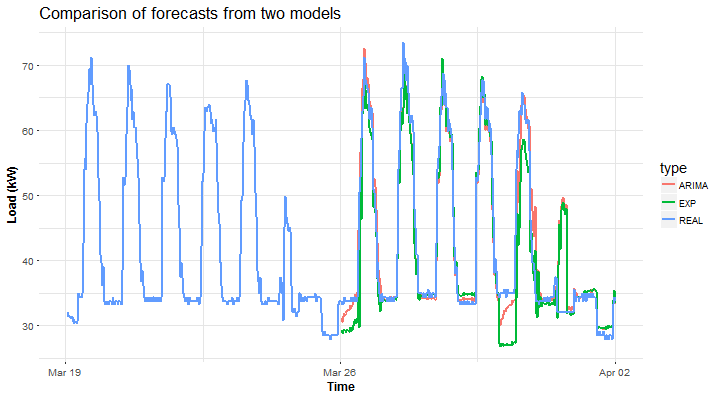
Again, STL+ARIMA is winning against STL+EXP.
In this way, you can make a forecast for any consumer, any set of dates and with your own forecast method.
Except for the two methods shown, you can try for example these functions (methods): HoltWinters, ar, arima and snaive, which are suitable for seasonal time series. These methods are starters (benchmarks) for time series analyses and forecast. In R, there are already implemented methods of time series, which can handle two seasons. For example dshw and tbats (both in the package forecast). Their disadvantage is high computational complexity and not as good results of the forecast as the custom functions that I have shown you. Script (1post-EnernocDataForecast.R) for a creation of whole analysis (tutorial) is on my GitHub repository.
To sum up, I have pointed out to you, which interesting features are contained in smart meter data. Then a forecast model with similar day approach was proposed. In my future posts, I want to focus mainly on regression methods for time series forecasting, because they can handle similar day approach (double seasonality) much easier. So methods like multiple linear regression, generalized additive model, support vector regression, regression trees and forests and artificial neural networks will be demonstrated.