This is especially for the excel lovers! In this blog, we will see few of the new and exciting data visualization features of Excel 2016.
Here is the list of new features
-
Hierarchy Chart/Tree Map
-
Sunburst
-
Water fall or Stock Chart
-
Transform Cold data into a cool picture
-
Instant Histogram
-
Pareto Chart
-
3D map
-
One click forecast
These are the most wanted charts by the Dashboard creators. These are very simple and attractive. This set of features makes excel more competitive with other expensive visualization tools.
- Hierarchy Chart/Tree Map:
Select the data that you want to use for creation of the chart then Go to ‘Insert’ tab > Charts > Insert Hierarchy Chart
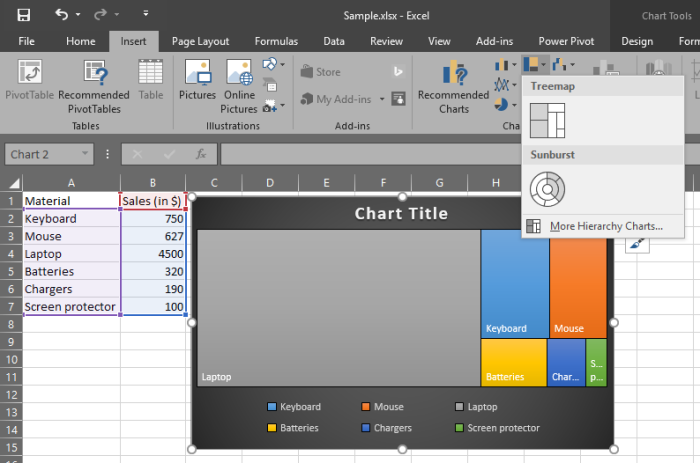
Isn’t it cool? OK, we go to the next one.
2. Sunburst/Donut Chart:
It is another representation of a Pie chart. An alternate to boring the Pie chart. Go to ‘Insert’ > Charts > Insert Hierarchy Chart
3. Water fall or Stock Chart
It is recommended to sort the data by any order to have the better insights.
4. Transform Cold data into a cool picture
This one is based on the Add-ins.

Select your data to visualize

Select ‘Settings’ to change the design of the charts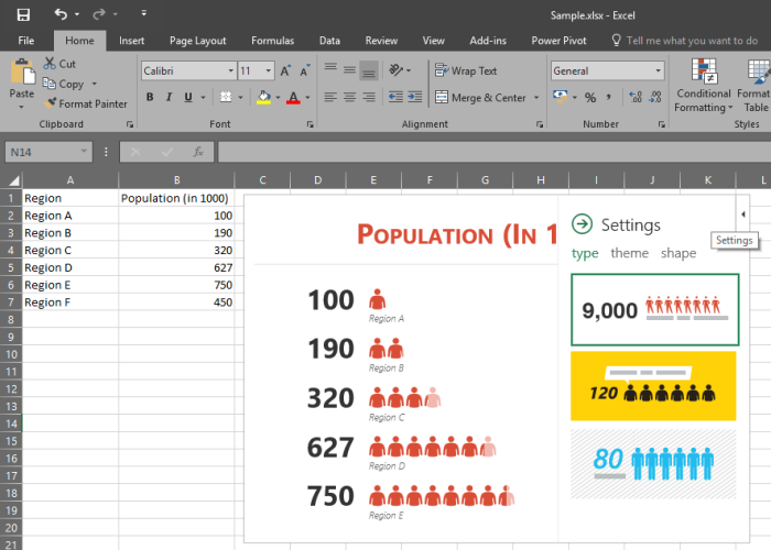
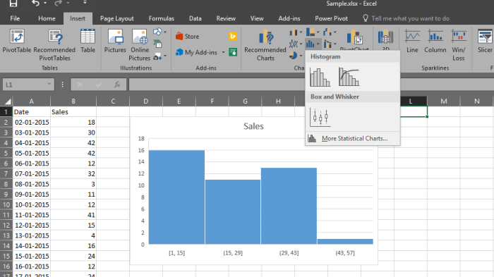
5. Instant Histogram:
Create histograms quickly instead of going to “Analysis Tool Pack” in add-ins. Go to Insert > Charts > Histogram
6. Pareto Chart:
Earlier, we had to customize the data structure to create ‘Pareto chart’ but now it is just a click away to explain the 80/20 principle.

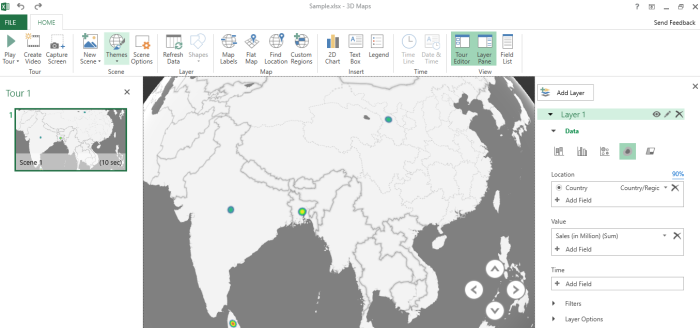
7. 3D map:
Power Map, the popular 3-D geospatial visualization add-in for Excel 2013, is now fully integrated into Excel. We’ve also this feature a more descriptive name, “3D Maps”. You’ll find this functionality alongside other visualization features on the Insert tab.
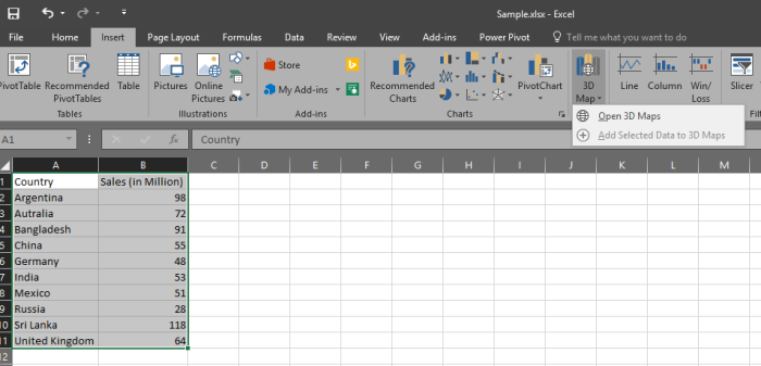
It will open another sheet like below 
then we can change the theme and other options like ‘2D Map’. “Play Tour” option will show an awesome chart with lively visual.

8. One click Forecast
It has become more easy for the Data analysts who do forecast.
Select the data that you want to forecast and Go to ‘Data’ tab > Click on “Forecast Sheet”
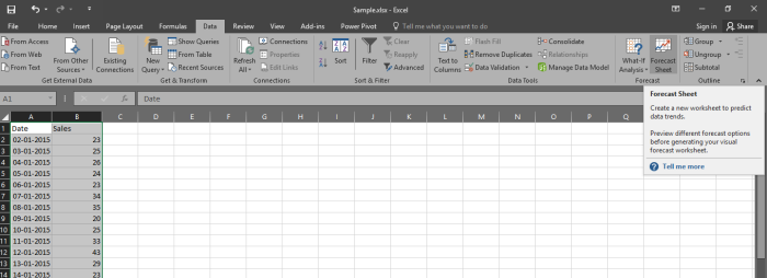
Adjust the “Seasonality” appropriately
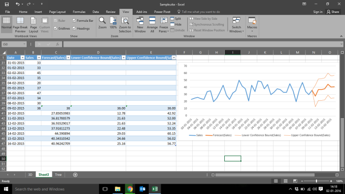
and your forecast is ready.
Hope you like these features and much more to come from Microsoft. Try these things and enjoy !
Like this:
Like Loading…
Related